Some GTK widgets don't have associated X windows, so they just draw on their parents. Because of this, they cannot receive events and if they are incorrectly sized, they don't clip so you can get messy overwriting, etc. If you require more from these widgets, the EventBox is for you.
At first glance, the EventBox widget might appear to be totally useless. It draws nothing on the screen and responds to no events. However, it does serve a function - it provides an X window for its child widget. This is important as many GTK widgets do not have an associated X window. Not having an X window saves memory and improves performance, but also has some drawbacks. A widget without an X window cannot receive events, and does not perform any clipping on its contents. Although the name EventBox emphasizes the event-handling function, the widget can also be used for clipping (and more, see the example below).
To create a new EventBox widget, use:
function gtk_event_box_new () : PGtkWidget;
A child widget can then be added to this EventBox:
gtk_container_add(GTK_CONTAINER(event_box), child_widget);
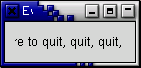
The following example demonstrates both uses of an EventBox - a label is created that is clipped to a small box, and set up so that a mouse-click on the label causes the program to exit. Resizing the window reveals varying amounts of the label.
program Eventbox;

uses gtk2, gdk2, glib2;

var
   window, event_box, a_label : PGtkWidget;

begin
   gtk_init(@argc, @argv);

   window := gtk_window_new(GTK_WINDOW_TOPLEVEL);

   gtk_window_set_title(GTK_WINDOW(window), 'Event Box');

   g_signal_connect(window, 'destroy',
                    G_CALLBACK(@gtk_main_quit), nil);

   gtk_container_set_border_width(GTK_CONTAINER(window), 10);

   { Create an EventBox and add it to our toplevel window }
   event_box := gtk_event_box_new();
   gtk_container_add(GTK_CONTAINER(window), event_box);
   gtk_widget_show(event_box);

   { Create a long label }
   a_label := gtk_label_new('Click here to quit, quit, quit');
   gtk_container_add(GTK_CONTAINER(event_box), a_label);
   gtk_widget_show(a_label);

   { Clip it short }
   gtk_widget_set_size_request(a_label, 110, 20);

   { And bind an action to it }
   gtk_widget_set_events(event_box, GDK_BUTTON_PRESS_MASK);
   g_signal_connect(event_box, 'button_press_event',
                    G_CALLBACK(@gtk_main_quit), nil);

   { Yet one more thing you need an X window for ...}
   gtk_widget_realize(event_box);
   gdk_window_set_cursor(event_box^.window, gdk_cursor_new(GDK_HAND1));

   gtk_widget_show(window);

   gtk_main();
end.
The alignment widget allows you to place a widget within its window at a position and size relative to the size of the Alignment widget itself. For example, it can be very useful for centering a widget within the window.
There is only one function and one procedure associated with the Alignment widget:
function gtk_alignment_new (xalign : gfloat;
                            yalign : gfloat;
                            xscale : gfloat;
                            yscale : gfloat) : PGtkWidget;

procedure gtk_alignment_set (alignment : PGtkAlignment;
                             xalign : gfloat;
                             yalign : gfloat;
                             xscale : gfloat;
                             yscale : gfloat);
The function creates a new Alignment widget with the specified parameters. The procedure allows the alignment parameters of an exisiting Alignment widget to be altered.
All four alignment parameters are floating point numbers which can range
from 0.0 to 1.0. The xalign and yalign arguments
affect the position of the widget placed within the Alignment widget.
The xscale and yscale arguments affect the amount
of space allocated to the widget.
A child widget can be added to this Alignment widget using:
gtk_container_add(GTK_CONTAINER(alignment), child_widget);
For an example of using an Alignment widget, refer to the example for the Progress Bar widget.
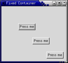
The Fixed container allows you to place widgets at a fixed position within it's window, relative to it's upper left hand corner. The position of the widgets can be changed dynamically.
There are only a few functions and procedures associated with the fixed widget:
function gtk_fixed_new () : PGtkWidget;

procedure gtk_fixed_put (fixed : PGtkFixed;
                         widget : PGtkWidget;
                         x : gint;
                         y : gint);

procedure gtk_fixed_move (fixed : PGtkFixed;
                          widget : PGtkWidget;
                          x : gint;
                          y : gint);
The function gtk_fixed_new() allows you
to create a new Fixed container.
gtk_fixed_put() places widget
in the container fixed at the position specified by x
and y.
gtk_fixed_move() allows the specified widget
to be moved to a new position.
procedure gtk_fixed_set_has_window (fixed : PGtkFixed,
                                    has_window : gboolean);

function gtk_fixed_get_has_window (fixed : PGtkFixed) : gboolean;
Normally, Fixed widgets don't have their own X window. Since this is different from the behaviour of Fixed widgets in earlier releases of GTK, the function gtk_fixed_set_has_window() allows the creation of Fixed widgets with their own window. It has to be called before realizing the widget.
The following example illustrates how to use the Fixed Container.
program fixedexample;

uses gtk2, glib2;

{ I'm going to be lazy and use some global variables to
  store the position of the widget within the fixed
  container }

var
   x : gint = 50;
   y : gint = 50;

{ This callback procedure moves the button to a new position
  in the Fixed container. }

procedure move_button (widget : PGtkWidget; fixed : PGtkWidget); cdecl;
begin
   x := (x + 30) mod 300;
   y := (y + 50) mod 300;
   gtk_fixed_move(GTK_FIXED(fixed), widget, x, y);
end;

var
   window, fixed, button : PGtkWidget;
   i : Integer;

begin
   { Initialise GTK }
   gtk_init(@argc, @argv);

   { Create a new window }
   window := gtk_window_new(GTK_WINDOW_TOPLEVEL);
   gtk_window_set_title(GTK_WINDOW(window), 'Fixed Container');

   { Here we connect the "destroy" event to a signal handler }
   g_signal_connect(window, 'destroy',
                    G_CALLBACK(@gtk_main_quit), nil);

   { Sets the border width of the window. }
   gtk_container_set_border_width(GTK_CONTAINER(window), 10);

   { Create a Fixed Container }
   fixed := gtk_fixed_new();
   gtk_container_add(GTK_CONTAINER(window), fixed);
   gtk_widget_show(fixed);

   for i := 1 to 3 do
   begin
      { Creates a new button with the label "Press me"}
      button := gtk_button_new_with_label('Press me');

      { When the button receives the "clicked" signal, it will call the
        function move_button() passing it the Fixed Container as its
        argument. }
      g_signal_connect(button, 'clicked',
                       G_CALLBACK(@move_button), fixed);

      { This packs the button into the fixed containers window. }
      gtk_fixed_put(GTK_FIXED(fixed), button, i * 50, i * 50);

      { The final step is to display this newly created widget. }
      gtk_widget_show(button);
   end;

   { Display the window }
   gtk_widget_show(window);

   { Enter the event loop }
   gtk_main();
end.
The Layout container is similar to the Fixed container except that it implements an infinite (where infinity is less than 2^32) scrolling area. The X window system has a limitation where windows can be at most 32767 pixels wide or tall. The Layout container gets around this limitation by doing some exotic stuff using window and bit gravities, so that you can have smooth scrolling even when you have many child widgets in your scrolling area.
A Layout container is created using:
function gtk_layout_new (hadjustment : PGtkAdjustment;
                         vadjustment : PGtkAdjustment) : PGtkWidget;
As you can see, you can optionally specify the Adjustment objects that the Layout widget will use for its scrolling.
You can add and move widgets in the Layout container using the following two procedures:
procedure gtk_layout_put (layout : PGtkLayout;
                          widget : PGtkWidget;
                          x : gint;
                          y : gint);

procedure gtk_layout_move (layout : PGtkLayout;
                           widget : PGtkWidget;
                           x : gint;
                           y : gint);
The size of the Layout container can be set using the next procedure:
procedure gtk_layout_set_size (layout : PGtkLayout;
                               width : guint;
                               height : guint);
The final two functions and two procedures for use with Layout widgets are for manipulating the horizontal and vertical adjustment widgets:
function gtk_layout_get_hadjustment (layout : PGtkLayout) : PGtkAdjustment;

function gtk_layout_get_vadjustment (layout : PGtkLayout) : PGtkAdjustment;

procedure gtk_layout_set_hadjustment (layout : PGtkLayout;
                                      adjustment : PGtkAdjustment);

procedure gtk_layout_set_vadjustment (layout : PGtkLayout;
                                      adjustment : PGtkAdjustment);
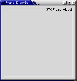
Frames can be used to enclose one or a group of widgets with a box which can optionally be labelled. The position of the label and the style of the box can be altered to suit.
A Frame can be created with the following function:
function gtk_frame_new (a_label : pgchar) : PGtkWidget;
The label is by default placed in the upper left hand corner of the frame.
A value of nil for the label argument will result
in no label being displayed. The text of the label can be changed
using the next procedure.
procedure gtk_frame_set_label (frame : PGtkFrame;
                               a_label : pgchar);
The position of the label can be changed using this procedure:
procedure gtk_frame_set_label_align (frame : PGtkFrame;
                                     xalign : gfloat;
                                     yalign : gfloat);
xalign and yalign take values between 0.0
and 1.0. xalign indicates the position of the label along
the top horizontal of the frame. yalign is not currently used.
The default value of xalign is 0.0 which places the label
at the left hand end of the frame.
The next procedure alters the style of the box that is used to outline the frame.
procedure gtk_frame_set_shadow_type (frame : PGtkFrame;
                                     type : TGtkShadowType);
The type argument can take one of the following values:
GTK_SHADOW_NONE
GTK_SHADOW_IN
GTK_SHADOW_OUT
GTK_SHADOW_ETCHED_IN (the default)
GTK_SHADOW_ETCHED_OUT
The following code example illustrates the use of the Frame widget.
program FrameExample;

uses gtk2, glib2;

var
   window, frame : PGtkWidget;

begin
   { Initialise GTK }
   gtk_init(@argc, @argv);

   { Create a new window }
   window := gtk_window_new(GTK_WINDOW_TOPLEVEL);
   gtk_window_set_title(GTK_WINDOW(window), 'Frame Example');

   { Here we connect the "destroy" event to a signal handler }
   g_signal_connect(window, 'destroy',
                    G_CALLBACK(@gtk_main_quit), nil);

   gtk_widget_set_size_request(window, 300, 300);

   { Sets the border width of the window. }
   gtk_container_set_border_width(GTK_CONTAINER(window), 10);

   { Create a Frame }
   frame := gtk_frame_new(nil);
   gtk_container_add(GTK_CONTAINER(window), frame);

   { Set the frame's label }
   gtk_frame_set_label(GTK_FRAME(frame), 'GTK Frame Widget');

   { Align the label at the right of the frame }
   gtk_frame_set_label_align(GTK_FRAME(frame), 1.0, 0.0);

   { Set the style of the frame }
   gtk_frame_set_shadow_type(GTK_FRAME(frame), GTK_SHADOW_ETCHED_OUT);

   gtk_widget_show(frame);

   { Display the window }
   gtk_widget_show(window);

   { Enter the event loop }
   gtk_main();
end.
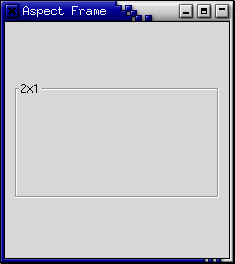
The aspect frame widget is like a frame widget, except that it also enforces the aspect ratio (that is, the ratio of the width to the height) of the child widget to have a certain value, adding extra space if necessary. This is useful, for instance, if you want to preview a larger image. The size of the preview should vary when the user resizes the window, but the aspect ratio needs to always match the original image.
To create a new aspect frame use:
function gtk_aspect_frame_new (a_label : pgchar;
                               xalign : gfloat;
                               yalign : gfloat;
                               ratio : gfloat;
                               obey_child : gint) : PGtkWidget;
xalign and yalign specify alignment
as with Alignment widgets. If obey_child is
true, the aspect ratio of a child widget
will match the aspect ratio of the ideal size it requests. Otherwise,
it is given by ratio.
To change the options of an existing aspect frame, you can use:
procedure gtk_aspect_frame_set (aspect_frame : PGtkAspectFrame;
                                xalign : gfloat;
                                yalign : gfloat;
                                ratio : gfloat;
                                obey_child : gint);
As an example, the following program uses an AspectFrame to present a drawing area whose aspect ratio will always be 2:1, no matter how the user resizes the top-level window.
program aspectframe;

uses gtk2, glib2;

var
   window, aspect_frame, drawing_area : pGtkWidget;

begin
   gtk_init(@argc, @argv);

   window := gtk_window_new(GTK_WINDOW_TOPLEVEL);
   gtk_window_set_title(GTK_WINDOW(window), 'Aspect Frame');
   g_signal_connect(window, 'destroy',
                    G_CALLBACK(@gtk_main_quit), nil);
   gtk_container_set_border_width(GTK_CONTAINER(window), 10);

   { Create an aspect_frame and add it to our toplevel window }
   aspect_frame := gtk_aspect_frame_new('2x1', { label }
                                        0.5, { center x }
                                        0.5, { center y }
                                        2, { xsize/ysize = 2 }
                                        false); { ignore child's aspect }

   gtk_container_add(GTK_CONTAINER(window), aspect_frame);
   gtk_widget_show(aspect_frame);

   { Now add a child widget to the aspect frame }
   drawing_area := gtk_drawing_area_new();

   { Ask for a 200x200 window, but the AspectFrame will give us a 200x100
     window since we are forcing a 2x1 aspect ratio}
   gtk_widget_set_size_request(drawing_area, 200, 200);
   gtk_container_add(GTK_CONTAINER(aspect_frame), drawing_area);
   gtk_widget_show(drawing_area);

   gtk_widget_show(window);
   gtk_main();
end.
The paned window widgets are useful when you want to divide an area into two parts, with the relative size of the two parts controlled by the user. A groove is drawn between the two portions with a handle that the user can drag to change the ratio. The division can either be horizontal (HPaned) or vertical (VPaned).
To create a new paned window, call one of:
function gtk_hpaned_new () : PGtkWidget;

function gtk_vpaned_new () : PGtkWidget;
After creating the paned window widget, you need to add child widgets to its two halves. To do this, use the procedures:
procedure gtk_paned_add1 (paned : PGtkPaned; child : PGtkWidget);

procedure gtk_paned_add2 (paned : PGtkPaned; child : PGtkWidget);
gtk_paned_add1() adds the child widget
to the left or top half of the paned window.
gtk_paned_add2() adds the child widget
to the right or bottom half of the paned window.
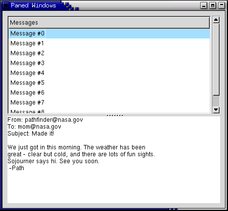
As an example, we will create part of the user interface of an imaginary
e-mail program. A window is divided into two portions vertically, with
the top portion being a list of e-mail messages and the bottom portion
the text of the e-mail message. Most of the program is pretty straightforward.
A couple of points to note: text can't be added to a Text widget until it is
realized. This could be done by calling
gtk_widget_realize(), but as a demonstration
of an alternate technique, we connect a handler to the 'realize' signal
to add the text. Also, we need to add the GTK_SHRINK option to some
of the items in the table containing the text window and its scrollbars,
so that when the bottom portion is made smaller, the correct portions shrink
instead of being pushed off the bottom of the window.
program PanedExample;

uses gtk2, gdk2, glib2, sysutils;

{ Create the list of "messages" }

function create_list() : PGtkWidget;
var
   scrolled_window, tree_view : PGtkWidget;
   model : PGtkListStore;
   iter : TGtkTreeIter;
   cell : PGtkCellRenderer;
   column : PGtkTreeViewColumn;
   i : Integer;
   msg : pgchar;

begin
   { Create a new scrolled window, with scrollbars only if needed }
   scrolled_window := gtk_scrolled_window_new(nil, nil);
   gtk_scrolled_window_set_policy(GTK_SCROLLED_WINDOW(scrolled_window),
				  GTK_POLICY_AUTOMATIC,
                                  GTK_POLICY_AUTOMATIC);

   model := gtk_list_store_new(1, G_TYPE_STRING);
   tree_view := gtk_tree_view_new();
   gtk_container_add(GTK_CONTAINER(scrolled_window), tree_view);
   gtk_tree_view_set_model(GTK_TREE_VIEW(tree_view), GTK_TREE_MODEL(model));
   gtk_widget_show(tree_view);

   { Add some messages to the window }
   for i := 1 to 10 do
   begin
      msg := g_strdup_printf('Message #%d', i);
      gtk_list_store_append(GTK_LIST_STORE(model), @iter);
      gtk_list_store_set(GTK_LIST_STORE(model),
                         @iter,
                         0, msg,
                         -1);
   end;

   cell := gtk_cell_renderer_text_new();

   column := gtk_tree_view_column_new_with_attributes('Messages',
                                                      cell,
                                                      'text', 0,
                                                      nil);

   gtk_tree_view_append_column(GTK_TREE_VIEW(tree_view),
                               GTK_TREE_VIEW_COLUMN(column));

   create_list := scrolled_window;
end;

{ Add some text to our text widget - this is a callback that is invoked
  when our window is realized.  We could also force our window to be
  realized with gtk_widget_realize(), but it would have to be
  part of a hierarchy first }

procedure insert_text (buffer : PGtkTextBuffer);
var
   iter : TGtkTextIter;
begin
   gtk_text_buffer_get_iter_at_offset(buffer, @iter, 0);

   gtk_text_buffer_insert(buffer, @iter,
    'From: pathfinder@nasa.gov'#10 +
    'To: mom@nasa.gov'#10 +
    'Subject: Made it!'#10 +
    #10 +
    'We just got in this morning. The weather has been'#10 +
    'great - clear but cold, and there are lots of fun sights.'#10 +
    'Sojourner says hi. See you soon.'#10 +
    ' -Path'+#10, -1);
end;

{ Create a scrolled text area that displays a "message" }

function create_text () : PGtkWidget;
var
   scrolled_window, view : PGtkWidget;
   buffer                : PGtkTextBuffer;
begin
   view := gtk_text_view_new();
   buffer := gtk_text_view_get_buffer(GTK_TEXT_VIEW(view));

   scrolled_window := gtk_scrolled_window_new(nil, nil);
   gtk_scrolled_window_set_policy(GTK_SCROLLED_WINDOW(scrolled_window),
                                  GTK_POLICY_AUTOMATIC,
                                  GTK_POLICY_AUTOMATIC);

   gtk_container_add(GTK_CONTAINER(scrolled_window), view);
   insert_text(buffer);

   gtk_widget_show_all(scrolled_window);

   create_text := scrolled_window;
end;

var
   window, vpaned, list, text : PGtkWidget;

begin
   gtk_init(@argc, @argv);

   window := gtk_window_new(GTK_WINDOW_TOPLEVEL);
   gtk_window_set_title(GTK_WINDOW(window), 'Paned Windows');
   g_signal_connect(window, 'destroy',
                    G_CALLBACK(@gtk_main_quit), NIL);
   gtk_container_set_border_width(GTK_CONTAINER(window), 10);
   gtk_widget_set_size_request(GTK_WIDGET(window), 450, 400);

   { Create a vpaned widget and add it to our toplevel window }
   vpaned := gtk_vpaned_new();
   gtk_container_add(GTK_CONTAINER(window), vpaned);
   gtk_widget_show(vpaned);

   { Now create the contents of the two halves of the window }
   list := create_list();
   gtk_paned_add1(GTK_PANED(vpaned), list);
   gtk_widget_show(list);

   text := create_text();
   gtk_paned_add2(GTK_PANED(vpaned), text);
   gtk_widget_show(text);
   gtk_widget_show(window);

   gtk_main();
end.
It is unlikely that you will ever need to use the Viewport widget directly. You are much more likely to use the Scrolled Window widget which itself uses the Viewport.
A viewport widget allows you to place a larger widget within it such that you can view a part of it at a time. It uses Adjustments to define the area that is currently in view.
A Viewport is created with the function
function gtk_viewport_new (hadjustment : PGtkAdjustment;
                           vadjustment : PGtkAdjustment) : PGtkWidget;
As you can see you can specify the horizontal and vertical Adjustments
that the widget is to use when you create the widget. It will create its own
if you pass nil as the value of the arguments.
You can get and set the adjustments after the widget has been created using the following functions and procedures:
function gtk_viewport_get_hadjustment (viewport : PGtkViewport) : PGtkAdjustment;

function gtk_viewport_get_vadjustment (viewport : PGtkViewport) : PGtkAdjustment;

procedure gtk_viewport_set_hadjustment (viewport : PGtkViewport;
                                        adjustment : PGtkAdjustment);

procedure gtk_viewport_set_vadjustment (viewport : PGtkViewport;
                                        adjustment : PGtkAdjustment);
The only other viewport procedure is used to alter its appearance:
procedure gtk_viewport_set_shadow_type (viewport : PGtkViewport;
                                        type : TGtkShadowType;
Possible values for the type parameter are:
GTK_SHADOW_NONE,
GTK_SHADOW_IN,
GTK_SHADOW_OUT,
GTK_SHADOW_ETCHED_IN,
GTK_SHADOW_ETCHED_OUT
Scrolled windows are used to create a scrollable area with another widget inside it. You may insert any type of widget into a scrolled window, and it will be accessible regardless of the size by using the scrollbars.
The following function is used to create a new scrolled window.
function gtk_scrolled_window_new (hadjustment : PGtkAdjustment;
                                  vadjustment : PGtkAdjustment) : PGtkWidget;
Where the first argument is the adjustment for the horizontal direction,
and the second, the adjustment for the vertical direction. These are almost
always set to nil.
procedure gtk_scrolled_window_set_policy (scrolled_window : PGtkScrolledWindow;
                                          hscrollbar_policy : TGtkPolicyType;
                                          vscrollbar_policy : TGtkPolicyType);
This sets the policy to be used with respect to the scrollbars. The first argument is the scrolled window you wish to change. The second sets the policy for the horizontal scrollbar, and the third the policy for the vertical scrollbar.
The policy may be one of GTK_POLICY_AUTOMATIC or
GTK_POLICY_ALWAYS. GTK_POLICY_AUTOMATIC will
automatically decide whether you need scrollbars, whereas
GTK_POLICY_ALWAYS will always leave the scrollbars there.
You can then place your object into the scrolled window using the following procedure:
procedure gtk_scrolled_window_add_with_viewport (scrolled_window : PGtkScrolledWindow;
                                                 child : PGtkWidget);
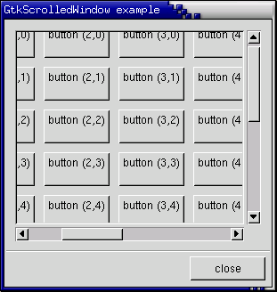
Here is a simple example that packs a table eith 100 toggle buttons into a scrolled window. I've only commented on the parts that may be new to you.
program Scrolledwin;

uses gtk2, glib2, sysutils;

procedure destroy (widget : PGtkWidget; data : gpointer); cdecl;
begin
   gtk_main_quit();
end;

var
   window, scrolled_window, table, button : PGtkWidget;
   i, j					  : Integer;
   label_str				  : String;
   l_str_as_char_ptr			  : pChar;

begin
   gtk_init(@argc, @argv);

   { Create a new dialog window for the scrolled window to be packed into }
   window := gtk_dialog_new();
   g_signal_connect(window, 'destroy',
                    G_CALLBACK(@destroy), nil);
   gtk_window_set_title(GTK_WINDOW(window), 'GtkScrolledWindow example');
   gtk_container_set_border_width(GTK_CONTAINER(window), 0);
   gtk_widget_set_size_request(window, 300, 300);

   { Create a new scrolled window. }
   scrolled_window := gtk_scrolled_window_new(nil, nil);

   gtk_container_set_border_width(GTK_CONTAINER(scrolled_window), 10);

   { The policy is one of GTK_POLICY_AUTOMATIC, or GTK_POLICY_ALWAYS.
     GTK_POLICY_AUTOMATIC will automatically decide whether you need
     scrollbars, whereas GTK_POLICY_ALWAYS will always leave the scrollbars
     there. The first one is the horizontal scrollbar, the second,
     the vertical.}
   gtk_scrolled_window_set_policy(GTK_SCROLLED_WINDOW(scrolled_window),
				  GTK_POLICY_AUTOMATIC, GTK_POLICY_ALWAYS);
   { The dialog window is created with a vbox packed into it. }
   gtk_box_pack_start(GTK_BOX(GTK_DIALOG(window)^.vbox), scrolled_window,
                      true, true, 0);
   gtk_widget_show(scrolled_window);

   { Create a table of 10 by 10 squares. }
   table := gtk_table_new(10, 10, false);

   { Set the spacing to 10 on x and 10 on y }
   gtk_table_set_row_spacings(GTK_TABLE(table), 10);
   gtk_table_set_col_spacings(GTK_TABLE(table), 10);

   { Pack the table into the scrolled window }
   gtk_scrolled_window_add_with_viewport(GTK_SCROLLED_WINDOW(scrolled_window),
                                         table);
   gtk_widget_show(table);

   { This simply creates a grid of toggle buttons on the table
     to demonstrate the scrolled window.}
   for i := 1 to 10 do
   begin
      for j := 1 to 10 do
      begin
	 label_str := 'Button (' + IntToStr(i) + ',' + IntToStr(j) + ')' + #10 + ' ';  //!!!
	 l_str_as_char_ptr := StrAlloc(Length(label_str) + 1);
	 StrPCopy(l_str_as_char_ptr, label_str);
	 button := gtk_toggle_button_new_with_label(l_str_as_char_ptr);
	 gtk_table_attach_defaults(GTK_TABLE(table), button,
                                   i, i + 1, j, j + 1);
	 gtk_widget_show(button);
      end;
   end;

   { Add a "close" button to the bottom of the dialog }
   button := gtk_button_new_with_label('close');
   g_signal_connect_swapped(button, 'clicked',
                            G_CALLBACK(@gtk_widget_destroy), window);

   { This makes it so the button is the default.}
   GTK_WIDGET_SET_FLAGS(button, GTK_CAN_DEFAULT);
   gtk_box_pack_start(GTK_BOX(GTK_DIALOG(window)^.action_area), button,
                      true, true, 0);

   { This grabs this button to be the default button. Simply hitting
     the "Enter" key will cause this button to activate. }
   gtk_widget_grab_default(button);
   gtk_widget_show(button);

   gtk_widget_show(window);

   gtk_main();
end.
Try playing with resizing the window. You'll notice how the scrollbars
react. You may also wish to use
the gtk_widget_set_size_request() call to set
the default size of the window or other widgets.
Button Boxes are a convenient way to quickly layout a group of buttons. They come in both horizontal and vertical flavours. You create a new Button Box with one of the following calls, which create a horizontal or vertical box, respectively:
function gtk_hbutton_box_new () : PGtkWidget;

function gtk_vbutton_box_new () : PGtkWidget;
Buttons are added to a Button Box using the usual procedure:
gtk_container_add(GTK_CONTAINER(button_box), child_widget);
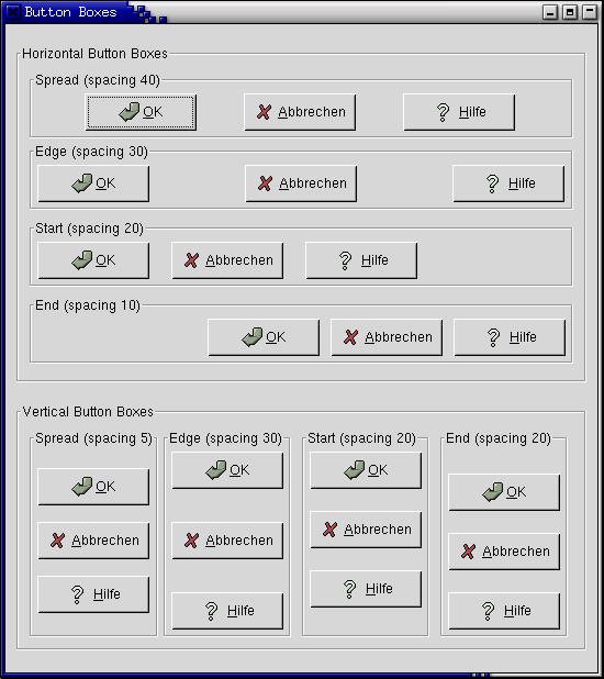
Here's an example that illustrates all the different layout settings for Button Boxes.
program ButtonBox;

uses gtk2, glib2;

{ Create a Button Box with the specified parameters }

function create_bbox (horizontal : boolean; title : pchar; spacing : gint;
                      child_w : gint; child_h : gint;
                      layout : gint) : PGtkWidget;
var
   frame, bbox, button : PGtkWidget;
begin
   frame := gtk_frame_new(title);

   if horizontal then
      bbox := gtk_hbutton_box_new()
   else
      bbox := gtk_vbutton_box_new();

   gtk_container_set_border_width(GTK_CONTAINER(bbox), 5);
   gtk_container_add(GTK_CONTAINER(frame), bbox);

   { Set the appearance of the Button Box }
   gtk_button_box_set_layout(GTK_BUTTON_BOX(bbox), layout);
   gtk_box_set_spacing(GTK_BUTTON_BOX(bbox), spacing);
   {gtk_button_box_set_child_size(GTK_BUTTON_BOX(bbox), child_w, child_h);}

   button := gtk_button_new_from_stock(GTK_STOCK_OK);
   gtk_container_add(GTK_CONTAINER(bbox), button);

   button := gtk_button_new_from_stock(GTK_STOCK_CANCEL);
   gtk_container_add(GTK_CONTAINER(bbox), button);

   button := gtk_button_new_from_stock(GTK_STOCK_HELP);
   gtk_container_add(GTK_CONTAINER (bbox), button);

   create_bbox := frame;
end;

var
   window, main_vbox, vbox, hbox, frame_horz, frame_vert : PGtkWidget;

begin
   { Initialise GTK }
   gtk_init(@argc, @argv);

   window := gtk_window_new(GTK_WINDOW_TOPLEVEL);
   gtk_window_set_title(GTK_WINDOW(window), 'Button Boxes');

   g_signal_connect(window, 'destroy',
                    G_CALLBACK(@gtk_main_quit), nil);

   gtk_container_set_border_width(GTK_CONTAINER(window), 10);

   main_vbox := gtk_vbox_new(false, 0);
   gtk_container_add(GTK_CONTAINER(window), main_vbox);

   frame_horz := gtk_frame_new('Horizontal Button Boxes');
   gtk_box_pack_start(GTK_BOX(main_vbox), frame_horz, true, true, 10);

   vbox := gtk_vbox_new(false, 0);
   gtk_container_set_border_width(GTK_CONTAINER(vbox), 10);
   gtk_container_add(GTK_CONTAINER(frame_horz), vbox);

   gtk_box_pack_start(GTK_BOX(vbox),
                      create_bbox(true, pchar('Spread (spacing 40)'), 40, 85,
                                  20, GTK_BUTTONBOX_SPREAD),
                      true, true, 0);

   gtk_box_pack_start(GTK_BOX(vbox),
                      create_bbox(true, pchar('Edge (spacing 30)'), 30, 85,
                                  20, GTK_BUTTONBOX_EDGE),
                      true, true, 5);

   gtk_box_pack_start(GTK_BOX(vbox),
                      create_bbox(true, pchar('Start (spacing 20)'), 20, 85,
                                  20, GTK_BUTTONBOX_START),
                      true, true, 5);

   gtk_box_pack_start(GTK_BOX(vbox),
                      create_bbox(true, pchar('End (spacing 10)'), 10, 85,
                                  20, GTK_BUTTONBOX_END),
                      true, true, 5);

   frame_vert := gtk_frame_new('Vertical Button Boxes');
   gtk_box_pack_start(GTK_BOX(main_vbox), frame_vert, true, true, 10);

   hbox := gtk_hbox_new(false, 0);
   gtk_container_set_border_width(GTK_CONTAINER(hbox), 10);
   gtk_container_add(GTK_CONTAINER(frame_vert), hbox);

   gtk_box_pack_start(GTK_BOX(hbox),
                      create_bbox(false, pchar('Spread (spacing 5)'), 5, 85,
                                  20, GTK_BUTTONBOX_SPREAD),
                      true, true, 0);

   gtk_box_pack_start(GTK_BOX(hbox),
                      create_bbox(false, pchar('Edge (spacing 30)'), 30, 85,
                                  20, GTK_BUTTONBOX_EDGE),
                      true, true, 5);

   gtk_box_pack_start(GTK_BOX(hbox),
                      create_bbox(false, pchar('Start (spacing 20)'), 20, 85,
                                  20, GTK_BUTTONBOX_START),
                      true, true, 5);

   gtk_box_pack_start(GTK_BOX(hbox),
                      create_bbox(false, pchar('End (spacing 20)'), 20, 85,
                                  20, GTK_BUTTONBOX_END),
                      true, true, 5);

   gtk_widget_show_all(window);

   { Enter the event loop }
   gtk_main();
end.
Toolbars are usually used to group some number of widgets in order to simplify customization of their look and layout. Typically a toolbar consists of buttons with icons, labels and tooltips, but any other widget can also be put inside a toolbar. Finally, items can be arranged horizontally or vertically and buttons can be displayed with icons, labels, or both.
Creating a toolbar is (as one may already suspect) done with the following function:
function gtk_toolbar_new () : PGtkWidget;
After creating a toolbar one can append, prepend and insert items (that means simple text strings) or elements (that means any widget types) into the toolbar. To describe an item we need a label text, a tooltip text, a private tooltip text, an icon for the button and a callback function for it. For example, to append or prepend an item you may use the following functions:
function gtk_toolbar_append_item (toolbar : PGtkToolbar;
                                  text : pchar;
                                  tooltip_text : pchar;
                                  tooltip_private_text : pchar;
                                  icon : PGtkWidget;
                                  callback : GCallback;
                                  user_data : gpointer) : PGtkWidget;

function gtk_toolbar_prepend_item (toolbar : PGtkToolbar;
                                   text : pchar;
                                   tooltip_text : pchar;
                                   tooltip_private_text : pchar;
                                   icon : PGtkWidget;
                                   callback : GCallback;
                                   user_data : gpointer) : PGtkWidget;
If you want to use gtk_toolbar_insert_item(),
the only additional parameter which must be specified is the position
in which the item should be inserted, thus:
function gtk_toolbar_insert_item (toolbar : PGtkToolbar;
                                  text : pchar;
                                  tooltip_text : pchar;
                                  tooltip_private_text : pchar;
                                  icon : PGtkWidget;
                                  callback : GCallback;
                                  user_data : gpointer;
                                  position : gint) : PGtkWidget;
To simplify adding spaces between toolbar items, you may use the following procedures:
procedure gtk_toolbar_append_space (toolbar : PGtkToolbar);

procedure gtk_toolbar_prepend_space (toolbar : PGtkToolbar);

procedure gtk_toolbar_insert_space (toolbar : PGtkToolbar;
                                    position : gint);
If it's required, the orientation of a toolbar and its style can be changed "on the fly" using the following procedures:
procedure gtk_toolbar_set_orientation (toolbar : PGtkToolbar;
                                       orientation : GtkOrientation);

procedure gtk_toolbar_set_style (toolbar : PGtkToolbar;
                                 style: GtkToolbarStyle);

procedure gtk_toolbar_set_tooltips (toolbar : PGtkToolbar;
                                    enable : gint);
Where orientation is one of
GTK_ORIENTATION_HORIZONTAL or
GTK_ORIENTATION_VERTICAL. The style is used to set
appearance of the toolbar items by using one of GTK_TOOLBAR_ICONS,
GTK_TOOLBAR_TEXT, or GTK_TOOLBAR_BOTH.
To show some other things that can be done with a toolbar, let's take the following program (we'll interrupt the listing with some additional explanations):
program ToolbarExample;

uses glib2, gdk2, gtk2;

{ This function is connected to the Close button or closing the window
  from the WM }

function delete_event (widget : PGtkWidget; event : PGdkEvent;
                       data : gpointer) : boolean; cdecl;
begin
   gtk_main_quit();
   delete_event := false;
end;
The above beginning seems for sure familiar to you if it's not your first GTK program. There is one additional thing though, we include a nice XPM picture to serve as an icon for all of the buttons.
var
   close_button : PGtkToolItem;  { This button will emit signal to close
                                   application }
   tooltips_button,  { to enable/disable tooltips }
   text_button : PGtkToolItem;
   icon_button : PGtkToolItem;
   both_button : PGtkToolItem;  { radio buttons for toolbar style }
   entry : PGtkWidget;  { a text entry to show packing any widget into
                          toolbar }
In fact not all of the above widgets are needed here, but to make things clearer I put them all together.
{ That's easy... when one of the buttons is toggled, we just check
  which one is active and set the style of the toolbar accordingly.
  ATTENTION: our toolbar is passed as data to callback! }

procedure radio_event (widget : PGtkWidget; data : gpointer); cdecl;
begin
   if gtk_toggle_tool_button_get_active(GTK_TOGGLE_TOOL_BUTTON(text_button)) then
      gtk_toolbar_set_style(GTK_TOOLBAR(data), GTK_TOOLBAR_TEXT)
   else if gtk_toggle_tool_button_get_active(GTK_TOGGLE_TOOL_BUTTON(icon_button)) then
      gtk_toolbar_set_style(GTK_TOOLBAR(data), GTK_TOOLBAR_ICONS)
   else if gtk_toggle_tool_button_get_active(GTK_TOGGLE_TOOL_BUTTON(both_button)) then
      gtk_toolbar_set_style(GTK_TOOLBAR(data), GTK_TOOLBAR_BOTH);
end;

{ Even easier, just check given toggle button and enable/disable tooltips}

procedure toggle_event (widget : PGtkWidget; data : gpointer); cdecl;
begin
   g_object_set(GTK_SETTINGS(data), 'gtk-enable-tooltips',
                gtk_toggle_tool_button_get_active(GTK_TOGGLE_TOOL_BUTTON(widget)),
                nil);
end;
The above are just two callbacks that will be called when one of the buttons on a toolbar is pressed. You should already be familiar with things like this if you've already used toggle buttons (and radio buttons).
var
   { Here is our main window (a dialog) and a handle for the handlebox }
   dialog, handlebox : PGtkWidget;

   { OK, we need a toolbar, and an icon widget to put the icon in
     (but we'll create a separate widget for each button) }
   toolbar, iconw : PGtkWidget;
   gap, item : PGtkToolItem;

   default_settings : PGtkSettings;

begin
   { This is called in all GTK application. }
   gtk_init(@argc, @argv); { Initialise GTK }

   default_settings := gtk_settings_get_default();
   g_object_set(default_settings, 'gtk-button-images', true, nil);

   { Create a new window with a given title, and nice size }
   dialog := gtk_dialog_new();
   gtk_window_set_title(GTK_WINDOW(dialog), 'GTKToolbar Tutorial');
   gtk_widget_set_size_request(GTK_WIDGET(dialog), 600, 300);
   g_object_set(GTK_WINDOW(dialog), 'allow-shrink', true, nil);

   { Typically we quit if someone tries to close us }
   g_signal_connect(dialog, 'delete-event',
                    GTK_SIGNAL_FUNC(@delete_event), nil);

   { We need to realize the window because we use pixmaps for items
     on the toolbar }
   gtk_widget_realize(dialog);

   { To make it nice we'll put the toolbar into the handle box, so that
     it can be detached from the main window }
   handlebox := gtk_handle_box_new();
   gtk_box_pack_start(GTK_BOX(GTK_DIALOG(dialog)^.vbox), handlebox,
                      false, false, 5);
The above should be similar to any other GTK application. Just initialization of GTK, creating the window, etc. There is only one thing that probably needs some explanation: a handle box. A handle box is just another box that can be used to pack widgets in to. The difference between it and typical boxes is that it can be detached from a parent window (or, in fact, the handle box remains in the parent, but it is reduced to a very small rectangle, while all of its contents are re-parented to a new freely floating window). It is usually nice to have a detachable toolbar, so these two widgets occur together quite often.
   { Toolbar will be horizontal, with both icons and text, and with 5pxl
     spaces between items and finally, we'll also put it into our handlebox }
   toolbar := gtk_toolbar_new();
   gtk_toolbar_set_orientation (GTK_TOOLBAR (toolbar),
                                GTK_ORIENTATION_HORIZONTAL);
   gtk_toolbar_set_style (GTK_TOOLBAR (toolbar), GTK_TOOLBAR_BOTH);
   gtk_container_set_border_width(GTK_CONTAINER(toolbar), 5);
   gtk_toolbar_set_space_size(GTK_TOOLBAR(toolbar), 5);
   gtk_container_add(GTK_CONTAINER(handlebox), toolbar);
Well, what we do above is just a straightforward initialization of the toolbar widget.
   { Our first item is close button }
   iconw := gtk_image_new_from_file("gtk.xpm"); { icon widget }
   gtk_widget_show(iconw);
   close_button := gtk_tool_button_new(iconw,     { icon widget }
                                       'Close');  { button label }
   gtk_widget_set(GTK_WIDGET(close_button), 'tooltip-text',
                  'Closes this app', nil);  { this button's tooltip }
   g_signal_connect(close_button, 'clicked', G_CALLBACK(@delete_event), nil);
   gtk_widget_show(GTK_WIDGET(close_button));
   gtk_toolbar_insert(GTK_TOOLBAR(toolbar), close_button, -1);
   { Space after item }
   gap := gtk_separator_tool_item_new();
   gtk_toolbar_insert(GTK_TOOLBAR(toolbar), gap, -1);
   gtk_widget_show(GTK_WIDGET(gap));
In the above code you see the simplest case: adding a button to toolbar.
Just before appending a new item, we have to construct an image widget
to serve as an icon for this item; this step will have to be repeated
for each new item. Just after the item we also add a space, so the following
items will not touch each other. As you see
gtk_toolbar_append_item() returns a pointer to our newly
created button widget, so that we can work with it in the normal way.
   { Now, let's make our radio buttons group... }
   iconw := gtk_image_new_from_file("gtk.xpm");
   gtk_widget_show(iconw);
   icon_button := gtk_radio_tool_button_new(NULL);
   gtk_tool_button_set_label(GTK_TOOL_BUTTON(icon_button), 'Icon');
   gtk_tool_button_set_icon_widget(GTK_TOOL_BUTTON(icon_button), iconw);
   gtk_widget_set(GTK_WIDGET(icon_button), 'tooltip-text',
                  'Only icons in toolbar', nil);
   g_signal_connect(icon_button, 'clicked', G_CALLBACK(@radio_event), toolbar);
   gtk_widget_show(GTK_WIDGET(icon_button));
   gtk_toolbar_insert(GTK_TOOLBAR(toolbar), icon_button, -1);
   gap := gtk_separator_tool_item_new();
   gtk_toolbar_insert(GTK_TOOLBAR(toolbar), gap, -1);
   gtk_widget_show(GTK_WIDGET(gap));
Here we begin creating a radio buttons group. To do this we use
gtk_toolbar_append_element(). In fact, using this function one
can also add simple items or even spaces (type =
GTK_TOOLBAR_CHILD_SPACE or
GTK_TOOLBAR_CHILD_BUTTON). In the above case we start creating
a radio group. In creating other radio buttons for this group a pointer
to the previous button in the group is required, so that a list of buttons
can be easily constructed (see the section on
Radio Buttons earlier in this tutorial).
   { Following radio buttons refer to previous ones }
   iconw := gtk_image_new_from_file("gtk.xpm");
   gtk_widget_show(iconw);
   text_button := gtk_radio_tool_button_new_from_widget(GTK_RADIO_TOOL_BUTTON(icon_button));
   gtk_tool_button_set_label(GTK_TOOL_BUTTON(text_button), 'Text');
   gtk_tool_button_set_icon_widget(GTK_TOOL_BUTTON(text_button), iconw);
   gtk_widget_set(GTK_WIDGET(text_button), 'tooltip-text',
                  'Only texts in toolbar', nil);
   g_signal_connect(text_button, 'clicked', G_CALLBACK(@radio_event), toolbar);
   gtk_widget_show(GTK_WIDGET(text_button));
   gtk_toolbar_insert(GTK_TOOLBAR(toolbar), text_button, -1);
   gap := gtk_separator_tool_item_new();
   gtk_toolbar_insert(GTK_TOOLBAR(toolbar), gap, -1);
   gtk_widget_show(GTK_WIDGET(gap));

   iconw := gtk_image_new_from_file("gtk.xpm");
   gtk_widget_show(iconw);
   both_button := gtk_radio_tool_button_new_from_widget(GTK_RADIO_TOOL_BUTTON(icon_button));
   gtk_tool_button_set_label(GTK_TOOL_BUTTON(both_button), 'Both');
   gtk_tool_button_set_icon_widget(GTK_TOOL_BUTTON(both_button), iconw);
   gtk_widget_set(GTK_WIDGET(both_button), 'tooltip-text',
                  'Icons and text in toolbar', nil);
   g_signal_connect(both_button, 'clicked', G_CALLBACK(@radio_event), toolbar);
   gtk_widget_show(GTK_WIDGET(both_button));
   gtk_toolbar_insert(GTK_TOOLBAR(toolbar), both_button, -1);
   gap := gtk_separator_tool_item_new();
   gtk_toolbar_insert(GTK_TOOLBAR(toolbar), gap, -1);
   gtk_widget_show(GTK_WIDGET(gap));
   gtk_toggle_tool_button_set_active(GTK_TOGGLE_TOOL_BUTTON(both_button), TRUE);
In the end we have to set the state of one of the buttons manually (otherwise they all stay in active state, preventing us from switching between them).
   { Here we have just a simple toggle button }
   iconw := gtk_image_new_from_file("gtk.xpm");
   gtk_widget_show(iconw);
   tooltips_button := gtk_toggle_tool_button_new();
   gtk_tool_button_set_label(GTK_TOOL_BUTTON(tooltips_button), 'Tooltips');
   gtk_tool_button_set_icon_widget(GTK_TOOL_BUTTON(tooltips_button), iconw);
   gtk_widget_set(GTK_WIDGET(tooltips_button), 'tooltip-text',
                  'Toolbar with or without tips', nil);
   g_signal_connect(tooltips_button, 'clicked',
                    G_CALLBACK(@toggle_event), default_settings);
   gtk_widget_show(GTK_WIDGET(tooltips_button));
   gtk_toolbar_insert(GTK_TOOLBAR(toolbar), tooltips_button, -1);
   gap := gtk_separator_tool_item_new();
   gtk_toolbar_insert(GTK_TOOLBAR(toolbar), gap, -1);
   gtk_widget_show(GTK_WIDGET(gap));
   gtk_toggle_tool_button_set_active(GTK_TOGGLE_TOOL_BUTTON(tooltips_button),
                                     true);
A toggle button can be created in the obvious way (if one knows how to create radio buttons already).
   { To pack a widget into toolbar, we only have to create it and append it
     with an appropriate tooltip }
   entry := gtk_entry_new();
   item := gtk_tool_item_new();
   gtk_container_add(GTK_CONTAINER(item), entry);
   gtk_widget_set(entry,'tooltip-text', 'This is just an entry', nil);
   { Well, it isn't created within the toolbar, so we must still show it }
   gtk_widget_show(entry);
   gtk_widget_show(GTK_WIDGET(item));
   gtk_toolbar_insert(GTK_TOOLBAR(toolbar), item, -1);
As you see, adding any kind of widget to a toolbar is simple.
   { That's it! Let's show everything. }
   gtk_widget_show(toolbar);
   gtk_widget_show(handlebox);
   gtk_widget_show(dialog);

   { Rest in gtk_main and wait for the fun to begin! }
   gtk_main();
end.
So, here we are at the end of toolbar tutorial. Of course, to appreciate it in full you need also this nice XPM icon, so here it is:
/* XPM */
static char *gtk_xpm[] = {
"32 39 5 1",
". c none",
"+ c black",
"@ c #3070E0",
"# c #F05050",
"$ c #35E035",
"................+...............",
"..............+++++.............",
"............+++++@@++...........",
"..........+++++@@@@@@++.........",
"........++++@@@@@@@@@@++........",
"......++++@@++++++++@@@++.......",
".....+++@@@+++++++++++@@@++.....",
"...+++@@@@+++@@@@@@++++@@@@+....",
"..+++@@@@+++@@@@@@@@+++@@@@@++..",
".++@@@@@@+++@@@@@@@@@@@@@@@@@@++",
".+#+@@@@@@++@@@@+++@@@@@@@@@@@@+",
".+##++@@@@+++@@@+++++@@@@@@@@$@.",
".+###++@@@@+++@@@+++@@@@@++$$$@.",
".+####+++@@@+++++++@@@@@+@$$$$@.",
".+#####+++@@@@+++@@@@++@$$$$$$+.",
".+######++++@@@@@@@++@$$$$$$$$+.",
".+#######+##+@@@@+++$$$$$$@@$$+.",
".+###+++##+##+@@++@$$$$$$++$$$+.",
".+###++++##+##+@@$$$$$$$@+@$$@+.",
".+###++++++#+++@$$@+@$$@++$$$@+.",
".+####+++++++#++$$@+@$$++$$$$+..",
".++####++++++#++$$@+@$++@$$$$+..",
".+#####+++++##++$$++@+++$$$$$+..",
".++####+++##+#++$$+++++@$$$$$+..",
".++####+++####++$$++++++@$$$@+..",
".+#####++#####++$$+++@++++@$@+..",
".+#####++#####++$$++@$$@+++$@@..",
".++####++#####++$$++$$$$$+@$@++.",
".++####++#####++$$++$$$$$$$$+++.",
".+++####+#####++$$++$$$$$$$@+++.",
"..+++#########+@$$+@$$$$$$+++...",
"...+++########+@$$$$$$$$@+++....",
".....+++######+@$$$$$$$+++......",
"......+++#####+@$$$$$@++........",
".......+++####+@$$$$+++.........",
".........++###+$$$@++...........",
"..........++##+$@+++............",
"...........+++++++..............",
".............++++..............."};
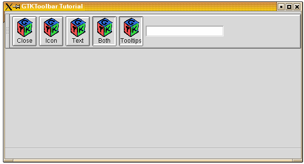
This is what the program looks like:
The NoteBook Widget is a collection of "pages" that overlap each other, each page contains different information with only one page visible at a time. This widget has become more common lately in GUI programming, and it is a good way to show blocks of similar information that warrant separation in their display.
The first function call you will need to know, as you can probably guess by now, is used to create a new notebook widget.
function gtk_notebook_new () : PGtkWidget;
Once the notebook has been created, there are a number of functions that operate on the notebook widget. Let's look at them individually.
The first one we will look at is how to position the page indicators. These page indicators or "tabs" as they are referred to, can be positioned in four ways: top, bottom, left, or right.
procedure gtk_notebook_set_tab_pos (notebook : PGtkNotebook;
                                    position : GtkPositionType);
GtkPositionType will be one of the following, which are pretty self explanatory:
  GTK_POS_LEFT
  GTK_POS_RIGHT
  GTK_POS_TOP
  GTK_POS_BOTTOM
GTK_POS_TOP is the default.
Next we will look at how to add pages to the notebook. There are three ways to add pages to the NoteBook. Let's look at the first two together as they are quite similar.
procedure gtk_notebook_append_page (notebook : PGtkNotebook;
                                    child : PGtkWidget;
                                    tab_label : PGtkWidget);

procedure gtk_notebook_prepend_page (notebook : PGtkNotebook;
                                     child : PGtkWidget;
                                     tab_label : PGtkWidget);
These procedures add pages to the notebook by inserting them from the back
of the notebook (append), or the front of the notebook (prepend).
child is the widget that is placed within the notebook page,
and tab_label is the label for the page being added.
The child widget must be created separately, and is typically
setup within one of the other container widgets, such as a table.
The final procedure for adding a page to the notebook contains all of the properties of the previous two, but it allows you to specify what position you want the page to be in the notebook.
procedure gtk_notebook_insert_page (notebook : PGtkNotebook;
                                    child : PGtkWidget;
                                    tab_label : PGtkWidget;
                                    position : gint);
The parameters are the same as _append_ and
_prepend_ except for the extra parameter, position.
This parameter is used to specify what place this page will be inserted
into the first page having position zero.
Now that we know how to add a page, let's see how we can remove a page from the notebook.
procedure gtk_notebook_remove_page (notebook : PGtkNotebook;
                                    page_num : gint);
This procedure takes the page specified by page_num and
removes it from the widget pointed to by notebook.
To find out what the current page is in a notebook use the function:
function gtk_notebook_get_current_page (notebook : PGtkNotebook) : gint;
The next two procedures are simple calls to move the notebook page forward or backward. Simply provide the respective procedure call with the notebook widget you wish to operate on.
Note: When the NoteBook is currently on the last page, and
gtk_notebook_next_page() is called, the notebook
will wrap back to the first page. Likewise, if the NoteBook is on the first
page, and gtk_notebook_prev_page() is called, the
notebook will wrap to the last page.
procedure gtk_notebook_next_page (notebook : PGtkNoteBook);

procedure gtk_notebook_prev_page (notebook : PGtkNoteBook);
This next procedure sets the "active" page. If you wish the notebook to be opened to page 5 for example, you would use this procedure. Without using this procedure, the notebook defaults to the first page.
procedure gtk_notebook_set_page (notebook : PGtkNoteBook;
                                 page_num : gint);
The next two procedures add or remove the notebook page tabs and the notebook border respectively.
procedure gtk_notebook_show_tabs (notebook : PGtkNoteBook;
                                  show_tabs : gboolean);

procedure gtk_notebook_show_border (notebook : PGtkNoteBook;
                                    show_border : gboolean);
The next function is useful when the you have a large number of pages, and the tabs don't fit on the page. It allows the tabs to be scrolled through using two arrow buttons.
procedure gtk_notebook_set_scrollable (notebook : PGtkNoteBook;
                                       scrollable : gboolean);
show_tabs, show_border and scrollable
can be either true or false.
Now let's look at an example, it is expanded from the testgtk.c
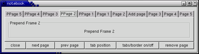
code that comes with the GTK distribution. This small program creates a window
with a notebook and six buttons. The notebook contains 11 pages, added
in three different ways, appended, inserted, and prepended. The buttons
allow you rotate the tab positions, add/remove the tabs and border, remove
a page, change pages in both a forward and backward manner,
and exit the program.
program NotebookExample;

uses glib2, gdk2, gtk2;

function itos (I : Longint) : String;
{ converts longint type to a String }
var
   S : String[15];
begin
   Str(I, S);
   itos := S;
end;

{ This function rotates the position of the tabs }

procedure rotate_book (button : PGtkButton; notebook : PGtkNotebook); cdecl;
begin
   gtk_notebook_set_tab_pos(notebook, TGtkPositionType((tab_pos(notebook^) + 1) mod 4));  //!!!
end;

{ Add/Remove the page tabs and the borders }

procedure tabsborder_book (button : PGtkButton; notebook : PGtkNotebook); cdecl;
var
   tval, bval : gboolean;
begin
   if not gtk_notebook_get_show_tabs(notebook) then
      tval := true
   else
      tval := false;
   if not gtk_notebook_get_show_border(notebook) then
      bval := true
   else
      bval := false;

   gtk_notebook_set_show_tabs(notebook, tval);
   gtk_notebook_set_show_border(notebook, bval);
end;

{ Remove a page from the notebook }

procedure remove_book (button : PGtkButton; notebook : PGtkNotebook); cdecl;
var
   page : gint ;
begin
   page := gtk_notebook_get_current_page(notebook);
   gtk_notebook_remove_page(notebook, page);
   { Need to refresh the widget -- This forces the widget to redraw itself. }
   gtk_widget_queue_draw(GTK_WIDGET(notebook));
end;

function delete (widget : PGtkWidget; event: pGdkEvent;
                 data: gpointer) : gboolean; cdecl;
begin
   gtk_main_quit();
   delete := false;
end;

var
   window, button, table, notebook, frame, a_label, checkbutton : PGtkWidget;
   i : integer;
   bufferf, bufferl : string[33];

begin
   gtk_init(@argc, @argv);

   window := gtk_window_new(GTK_WINDOW_TOPLEVEL);

   g_signal_connect(window, 'delete-event',
                    G_CALLBACK(@delete), NIL);

   gtk_container_set_border_width(GTK_CONTAINER(window), 10);

   table := gtk_table_new(2, 6, false);
   gtk_container_add(GTK_CONTAINER(window), table);

   { Create a new notebook, place the position of the tabs }
   notebook := gtk_notebook_new();
   gtk_notebook_set_tab_pos(GTK_NOTEBOOK(notebook), GTK_POS_TOP);
   gtk_table_attach_defaults(GTK_TABLE(table), notebook, 0, 6, 0, 1);
   gtk_widget_show(notebook);

   { Let's append a bunch of pages to the notebook }
   for i := 1 to 5 do
   begin
      bufferf := 'Append Frame ' + itos(i) + #0;  //!!!
      bufferl := 'Page ' + itos(i) + #0;

      frame := gtk_frame_new(pchar(@bufferf[1]));
      gtk_container_set_border_width(GTK_CONTAINER(frame), 10);
      gtk_widget_set_size_request(frame, 100, 75);
      gtk_widget_show(frame);

      a_label := gtk_label_new(pchar(@bufferf[1]));
      gtk_container_add(pGTKCONTAINER (frame), a_label);
      gtk_widget_show(a_label);

      a_label := gtk_label_new(pchar(@bufferl[1]));
      gtk_notebook_append_page(GTK_NOTEBOOK(notebook), frame, a_label);
   end;

   { Now let's add a page to a specific spot }
   checkbutton := gtk_check_button_new_with_label('Check me please!');
   gtk_widget_set_size_request(checkbutton, 100, 75);
   gtk_widget_show(checkbutton);

   a_label := gtk_label_new('Add page');
   gtk_notebook_insert_page(GTK_NOTEBOOK(notebook), checkbutton, a_label, 2);

   { Now finally let's prepend pages to the notebook }
   for i := 1 to 5 do
   begin
      bufferf := 'Prepend Frame ' + itos(i) + #0;  //!!!
      bufferl := 'PPage ' + itos(i) + #0;

      frame := gtk_frame_new(pchar(@bufferf[1]));
      gtk_container_set_border_width(GTK_CONTAINER(frame), 10);
      gtk_widget_set_size_request(frame, 100, 75);
      gtk_widget_show(frame);

      a_label := gtk_label_new(pchar(@bufferf[1]));
      gtk_container_add(GTK_CONTAINER(frame), a_label);
      gtk_widget_show(a_label);

      a_label := gtk_label_new(pchar(@bufferl[1]));
      gtk_notebook_prepend_page(GTK_NOTEBOOK(notebook), frame, a_label);
   end;

   { Set what page to start at (page 4) }
   gtk_notebook_set_current_page(GTK_NOTEBOOK(notebook), 3);

   { Create a bunch of buttons }
   button := gtk_button_new_with_label('close');
   g_signal_connect_swapped(button, 'clicked',
                            G_CALLBACK(@delete), nil);
   gtk_table_attach_defaults(GTK_TABLE(table), button, 0, 1, 1, 2);
   gtk_widget_show(button);

   button := gtk_button_new_with_label('next page');
   g_signal_connect_swapped(button, 'clicked',
                            G_CALLBACK(@gtk_notebook_next_page),
                            notebook);
   gtk_table_attach_defaults(GTK_TABLE(table), button, 1, 2, 1, 2);
   gtk_widget_show(button);

   button := gtk_button_new_with_label('prev page');
   g_signal_connect_swapped(button, 'clicked',
                            G_CALLBACK(@gtk_notebook_prev_page),
                            notebook);
   gtk_table_attach_defaults(GTK_TABLE(table), button, 2, 3, 1, 2);
   gtk_widget_show(button);

   button := gtk_button_new_with_label('tab position');
   g_signal_connect(button, 'clicked',
                    G_CALLBACK(@rotate_book), notebook);
   gtk_table_attach_defaults(GTK_TABLE(table), button, 3, 4, 1, 2);
   gtk_widget_show(button);

   button := gtk_button_new_with_label('tabs/border on/off');
   g_signal_connect(button, 'clicked',
                    G_CALLBACK(@tabsborder_book), notebook);
   gtk_table_attach_defaults(GTK_TABLE(table), button, 4, 5, 1, 2);
   gtk_widget_show(button);

   button := gtk_button_new_with_label('remove page');
   g_signal_connect(button, 'clicked',
                    G_CALLBACK(@remove_book), notebook);
   gtk_table_attach_defaults(GTK_TABLE(table), button, 5, 6, 1, 2);
   gtk_widget_show(button);

   gtk_widget_show(table);
   gtk_widget_show(window);

   gtk_main ();
end.
I hope this helps you on your way with creating notebooks for your GTK applications.