We've almost seen all there is to see of the button widget. It's
pretty simple. There is however more than one way to create a button. You
can use the gtk_button_new_with_label()
or gtk_button_new_with_mnemonic() to create a button with a label,
use gtk_button_new_from_stock() to create a button containing the image
and text from a stock item or use gtk_button_new()
to create a blank button. It's then up to you to pack a label or pixmap
into this new button. To do this, create a new box, and then pack your
objects into this box using the usual
gtk_box_pack_start(), and then
use gtk_container_add() to
pack the box into the button.
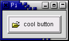
Here's an example of using gtk_button_new()
to create a button with a picture and a label in it. I've broken up
the code to create a box from the rest so you can use it in your programs.
There are further examples of using pixmaps later in the tutorial.
program buttons;

uses gtk2, gdk2, glib2;

{ Create a new hbox with an image and a label packed into it
  and return the box }

function xpm_label_box (xpm_filename : pgchar;
                        label_text : pgchar) : PGtkWidget;
var
   box	   : PGtkWidget;
   a_label : PGtkWidget;
   image   : PGtkWidget;

begin
   { Create box for xpm and label }
   box := gtk_hbox_new(false, 0);
   gtk_container_set_border_width(GTK_CONTAINER(box), 2);

   { Now on to the image stuff. }
   image := gtk_image_new_from_file(xpm_filename);

   { Create a label for the button. }
   a_label := gtk_label_new(label_text);

   { Pack the image and label into the box. }
   gtk_box_pack_start(GTK_BOX(box), image, false, false, 3);
   gtk_box_pack_start(GTK_BOX(box), a_label, false, false, 3);

   gtk_widget_show(image);
   gtk_widget_show(a_label);

   xpm_label_box := box;
end;

{ Our usual callback function. }

procedure callback (Widget : PGtkWidget; data : gpointer); cdecl;
begin
   writeln('Hello again - ', PChar(data), ' was pressed');
end;

var
   window, button, box: PGtkWidget;

begin
   gtk_init(@argc, @argv);

   { Create a new window. }
   window := gtk_window_new(GTK_WINDOW_TOPLEVEL);

   gtk_window_set_title(GTK_WINDOW(window), 'Pixmap''d Buttons!');

   {It's a good idea to do this for all windows.}
   g_signal_connect(window, 'destroy',
                    G_CALLBACK(@gtk_main_quit), nil);
   g_signal_connect(window, 'delete-event',
                    G_CALLBACK(@gtk_main_quit), nil);

   { Sets the border width of the window. }
   gtk_container_set_border_width(GTK_CONTAINER(window), 10);

   { Create a new button }
   button := gtk_button_new;

   { Connect the "clicked" signal of the button to our callback }
   g_signal_connect(button, 'clicked',
                    G_CALLBACK(@callback), pchar('cool button'));

   { This calls our box creating function }
   box := xpm_label_box('info.xpm', 'cool button');

   { Pack and show all our widgets }
   gtk_widget_show(box);

   gtk_container_add(GTK_CONTAINER(button), box);

   gtk_widget_show(button);

   gtk_container_add(GTK_CONTAINER(window), button);

   gtk_widget_show(window);

   { Rest in gtk_main and wait for the fun to begin! }
   gtk_main;
end.
The xpm_label_box function could be used to pack xpm's and labels into any widget that can be a container.
The button widget has the following signals:
Toggle buttons are derived from normal buttons and are very similar, except they will always be in one of two states, alternated by a click. They may be depressed, and when you click again, they will pop back up. Click again, and they will pop back down.
Toggle buttons are the basis for check buttons and radio buttons, as such, many of the calls used for toggle buttons are inherited by radio and check buttons. I will point these out when we come to them.
Creating a new toggle button:
function gtk_toggle_button_new() : PGtkWidget;

function gtk_toggle_button_new_with_label (a_label : pchar ) : PGtkWidget;

function gtk_toggle_button_new_with_mnemonic ((a_label : pchar ) : PGtkWidget;
As you can imagine, these work identically to the normal button widget calls. The first creates a blank toggle button, and the last two, a button with a label widget already packed into it. The _mnemonic() variant additionally parses the label for '_'-prefixed mnemonic characters.
To retrieve the state of the toggle widget, including radio and check buttons, we use a construct as shown in our example below. This tests the state of the toggle, by accessing the active field of the toggle widget's structure, after first using the GTK_TOGGLE_BUTTON macro to cast the widget pointer into a toggle widget pointer. The signal of interest to us emitted by toggle buttons (the toggle button, check button, and radio button widgets) is the toggled signal. To check the state of these buttons, set up a signal handler to catch the toggled signal, and access the structure to determine its state. The callback will look something like:
procedure toggle_button_callback (widget : PGtkWidget;
                                  data : pgpointer);
begin
   if gtk_toggle_button_get_active(GTK_TOGGLE_BUTTON(widget)) then
      { if control reaches here, the toggle button is down }
   else
      { if control reaches here, the toggle button is up };
end;
To force the state of a toggle button, and its children, the radio and check buttons, use this function:
procedure gtk_toggle_button_set_active (toggle_button : PGtkToggleButton;
                                        is_active : boolean);
The above call can be used to set the state of the toggle button,
and its children the radio and check buttons. Passing in your created button
as the first argument, and a true
or false for the second state argument
to specify whether it should be down (depressed) or up (released).
Default is up, or false.
Note that when you use the
gtk_toggle_button_set_active() function,
and the state is actually changed, it causes the 'clicked' and 'toggled'
signals to be emitted from the button.
function gtk_toggle_button_get_active (toggle_button : PGtkToggleButton) : boolean;
This returns the current state of the toggle button as a boolean true/false value.
Check buttons inherit many properties and functions from the toggle buttons above, but look a little different. Rather than being buttons with text inside them, they are small squares with the text to the right of them. These are often used for toggling options on and off in applications.
The creation functions are similar to those of the normal button.
function gtk_check_button_new () : PGtkWidget;

function gtk_check_button_new_with_label (a_label : pchar) : PGtkWidget;

function gtk_check_button_new_with_mnemonic (a_label : pchar) : PGtkWidget;
The gtk_check_button_new_with_label()
function creates a check button with a label beside it.
Checking the state of the check button is identical to that of the toggle button.
Radio buttons are similar to check buttons except they are grouped so that only one may be selected/depressed at a time. This is good for places in your application where you need to select from a short list of options.
Creating a new radio button is done with one of these calls:
function gtk_radio_button_new (group : PGSList) : PGtkWidget;

function gtk_radio_button_new_from_widget (group : PGtkRadioButton) : PGtkWidget;

function gtk_radio_button_new_with_label (group : PGSList;
                                          a_label : gpointer) : PGtkWidget;

function gtk_radio_button_new_with_label_from_widget (group : PGtkRadioButton;
                                                      a_label : gpointer) : PGtkWidget;

function gtk_radio_button_new_with_mnemonic (group : PGSList;
                                             a_label : gpointer) : PGtkWidget;

function gtk_radio_button_new_with_mnemonic_from_widget (group : PGtkRadioButton;
                                                         a_label : gpointer) : PGtkWidget;
You'll notice the extra argument to these calls. They require a group
to perform their duty properly. The first call to
gtk_radio_button_new()
or gtk_radio_button_new_with_label() should
pass nil as the first argument. Then create a group using:
function gtk_radio_button_get_group (radio_button : PGtkRadioButton) : PGSList;
The important thing to remember is that
gtk_radio_button_get_group() must be called for each new button
added to the group, with the previous button passed in as an argument.
The result is then passed into the next call
to gtk_radio_button_new()
or gtk_radio_button_new_with_label().
This allows a chain of buttons to be established. The example below
should make this clear.
You can shorten this slightly by using the following syntax, which removes the need for a variable to hold the list of buttons:
button2 := gtk_radio_button_new_with_label(
            gtk_radio_button_get_group(GTK_RADIO_BUTTON(button1)),
            'button2');
The _from_widget() variants of the creation functions allow you to shorten this further, by omitting the gtk_radio_button_get_group() call. This form is used in the example to create the third button:
button2 := gtk_radio_button_new_with_label_from_widget(
            GTK_RADIO_BUTTON(button1),
            'button2');
It is also a good idea to explicitly set which button should be the default depressed button with:
procedure gtk_toggle_button_set_active (toggle_button : PGtkToggleButton;
                                        state : gboolean);
This is described in the section on toggle buttons, and works in exactly the same way. Once the radio buttons are grouped together, only one of the group may be active at a time. If the user clicks on one radio button, and then on another, the first radio button will first emit a 'toggled' signal (to report becoming inactive), and then the second will emit its 'toggled' signal (to report becoming active).
The following example creates a radio button group with three buttons.
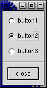
program radiobuttons;

uses gtk2, gdk2, glib2;

function close_application (widget : PGtkWidget; event : PGdkEvent;
                            data : gpointer) : boolean; cdecl;
begin
   gtk_main_quit();
   close_application := false;
end;

var
   window, box1, box2, button, separator : PGtkWidget;
   group : PGSList;

begin
   gtk_init(@argc,@argv);

   window := gtk_window_new(GTK_WINDOW_TOPLEVEL);

   g_signal_connect(window, 'delete-event',
                    G_CALLBACK(@close_application), nil);

   gtk_window_set_title(GTK_WINDOW(window), 'radio buttons');
   gtk_container_set_border_width(GTK_CONTAINER(window), 0);

   box1 := gtk_vbox_new(false, 0);
   gtk_container_add(GTK_CONTAINER(window), box1);
   gtk_widget_show(box1);

   box2 := gtk_vbox_new(false, 10);
   gtk_container_set_border_width(GTK_CONTAINER(box2), 10);
   gtk_box_pack_start(GTK_BOX(box1), box2, true, true, 0);
   gtk_widget_show(box2);

   button := gtk_radio_button_new_with_label(nil, 'button1');
   gtk_box_pack_start(GTK_BOX(box2), button, true, true, 0);
   gtk_widget_show(button);

   group := gtk_radio_button_get_group(GTK_RADIO_BUTTON(button));
   button := gtk_radio_button_new_with_label(group, 'button2');
   gtk_toggle_button_set_active(GTK_TOGGLE_BUTTON(button), true);
   gtk_box_pack_start(GTK_BOX(box2), button, true, true, 0);
   gtk_widget_show(button);

   button := gtk_radio_button_new_with_label_from_widget(GTK_RADIO_BUTTON(button),
                                                         'button3');
   gtk_box_pack_start(GTK_BOX(box2), button, true, true, 0);
   gtk_widget_show(button);

   separator := gtk_hseparator_new;
   gtk_box_pack_start(GTK_BOX(box1), separator, false, true, 0);
   gtk_widget_show(separator);

   box2 := gtk_vbox_new(false, 10);
   gtk_container_set_border_width(GTK_CONTAINER(box2), 10);
   gtk_box_pack_start(GTK_BOX(box1), box2, false, true, 0);
   gtk_widget_show(box2);

   button := gtk_button_new_with_label('close');
   g_signal_connect_swapped(button, 'clicked',
                            G_CALLBACK(@close_application), window);
   gtk_box_pack_start(GTK_BOX(box2), button, true, true, 0);
   GTK_WIDGET_SET_FLAGS(button, GTK_CAN_DEFAULT);
   gtk_widget_grab_default(button);
   gtk_widget_show(button);
   gtk_widget_show(window);

   gtk_main();
end.