
Labels are used a lot in GTK, and are relatively simple. Labels emit no signals as they do not have an associated X window. If you need to catch signals, or do clipping, place it inside an EventBox widget or a Button widget.
To create a new label, use:
function gtk_label_new (str : pchar) : PGtkWidget;

function gtk_label_new_with_mnemonic (str : pchar) : PGtkWidget;
The sole argument is the string you wish the label to display.
To change the label's text after creation, use the procedure:
procedure gtk_label_set_text (a_label : PGtkLabel; str : pchar );
The first argument is the label you created previously (cast using the GTK_LABEL() macro), and the second is the new string.
The space needed for the new string will be automatically adjusted if needed. You can produce multi-line labels by putting line breaks in the label string.
To retrieve the current string, use:
function gtk_label_get_text (a_label : PGtkLabel) : pgchar;
Do not free the returned string, as it is used internally by GTK.
The label text can be justified using:
procedure gtk_label_set_justify (a_label : PGtkLabel;
                                 jtype : GtkJustification);  {Longint}
Values for jtype are:
GTK_JUSTIFY_LEFT
GTK_JUSTIFY_RIGHT
GTK_JUSTIFY_CENTER (the default)
GTK_JUSTIFY_FILL
The label widget is also capable of line wrapping the text automatically. This can be activated using:
procedure gtk_label_set_line_wrap (a_label : PGtkLabel; wrap : boolean);
The wrap argument takes a true
or false value.
If you want your label underlined, then you can set a pattern on the label:
procedure gtk_label_set_pattern (a_label : PGtkLabel; a_pattern : pgchar);
The pattern argument indicates how the underlining should look.
It consists of a string of underscore and space characters. An underscore
indicates that the corresponding character in the label should be underlined.
For example, the string '__ __' would underline
the first two characters and eight and ninth characters.
| If you simply want to have an underlined accelerator ("mnemonic") in your label, you should use gtk_label_new_with_mnemonic() or gtk_label_set_text_with_mnemonic(), not gtk_label_set_pattern(). |
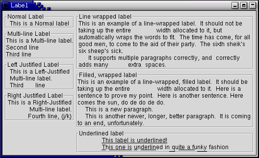
Below is a short example to illustrate these functions. This example makes use of the Frame widget to better demonstrate the label styles. You can ignore this for now as the Frame widget is explained later on.
program labelexample;

uses gtk2, glib2;

var
   window, hbox, vbox, frame, a_label : PGtkWidget;

begin
   { Initialise GTK }
   gtk_init(@argc, @argv);

   window := gtk_window_new(GTK_WINDOW_TOPLEVEL);
   g_signal_connect(window, 'destroy',
                    G_CALLBACK(@gtk_main_quit), nil);

   gtk_window_set_title(GTK_WINDOW(window), 'Label');
   vbox := gtk_vbox_new(false, 5);
   hbox := gtk_hbox_new(false, 5);
   gtk_container_add(GTK_CONTAINER(window), hbox);
   gtk_box_pack_start(GTK_BOX(hbox), vbox, false, false, 0);
   gtk_container_set_border_width(GTK_CONTAINER(window), 5);

   frame := gtk_frame_new('Normal Label');
   a_label := gtk_label_new('This is a Normal label');
   gtk_container_add(GTK_CONTAINER(frame), a_label);
   gtk_box_pack_start(GTK_BOX(vbox), frame, false, false, 0);

   frame := gtk_frame_new('Multi-line Label');
   a_label := gtk_label_new('This is a Multi-line label.'#10'Second line'#10 +
                            'Third line');
   gtk_container_add(GTK_CONTAINER(frame), a_label);
   gtk_box_pack_start(GTK_BOX(vbox), frame, false, false, 0);

   frame := gtk_frame_new('Left Justified Label');
   a_label := gtk_label_new('This is a Left-Justified'#10 +
                            'Multi-line label.'#10'Third      line');
   gtk_label_set_justify(GTK_LABEL(a_label), GTK_JUSTIFY_LEFT);
   gtk_container_add(GTK_CONTAINER(frame), a_label);
   gtk_box_pack_start(GTK_BOX(vbox), frame, false, false, 0);

   frame := gtk_frame_new('Right Justified Label');
   a_label := gtk_label_new('This is a Right-Justified'#10'Multi-line label.'#10 +
                            'Fourth line, (j/k)');
   gtk_label_set_justify(GTK_LABEL(a_label), GTK_JUSTIFY_RIGHT);
   gtk_container_add(GTK_CONTAINER(frame), a_label);
   gtk_box_pack_start(GTK_BOX(vbox), frame, false, false, 0);

   vbox := gtk_vbox_new(false, 5);
   gtk_box_pack_start(GTK_BOX(hbox), vbox, false, false, 0);
   frame := gtk_frame_new('Line wrapped label');
   a_label := gtk_label_new('This is an example of a line-wrapped label.  It ' +
                            'should not be taking up the entire             ' +
                            'width allocated to it, but automatically ' +
                            'wraps the words to fit.  ' +
                            'The time has come, for all good men, to come to ' +
                            'the aid of their party.  ' +
                            'The sixth sheik''s six sheep''s sick.'#10 +
                            ' It supports multiple paragraphs correctly, ' +
                            'and  correctly   adds ' +
                            'many          extra spaces. ');
   gtk_label_set_line_wrap(GTK_LABEL(a_label), true);
   gtk_container_add(GTK_CONTAINER(frame), a_label);
   gtk_box_pack_start(GTK_BOX(vbox), frame, false, false, 0);

   frame := gtk_frame_new('Filled, wrapped label');
   a_label := gtk_label_new('This is an example of a line-wrapped, filled label.  ' +
                            'It should be taking ' +
                            'up the entire              width allocated to it.  ' +
                            'Here is a sentence to prove ' +
                            'my point.  Here is another sentence. ' +
                            'Here comes the sun, do de do de do.'#10 +
                            '    This is a new paragraph.'#10 +
                            '    This is another newer, longer, better ' +
                            'paragraph.  It is coming to an end, ' +
                            'unfortunately.');
   gtk_label_set_justify(GTK_LABEL(a_label), GTK_JUSTIFY_FILL);
   gtk_label_set_line_wrap(GTK_LABEL(a_label), true);
   gtk_container_add(GTK_CONTAINER(frame), a_label);
   gtk_box_pack_start(GTK_BOX(vbox), frame, false, false, 0);

   frame := gtk_frame_new('Underlined label');
   a_label := gtk_label_new('This label is underlined!'#10 +
                            'This one is underlined in quite a funky fashion');
   gtk_label_set_justify(GTK_LABEL(a_label), GTK_JUSTIFY_LEFT);
   gtk_label_set_pattern(GTK_LABEL(a_label),
                         '_________________________ _ _________ _ ______     __ _______ ___');
   gtk_container_add(GTK_CONTAINER(frame), a_label);
   gtk_box_pack_start(GTK_BOX(vbox), frame, false, false, 0);

   gtk_widget_show_all(window);

   gtk_main();
end.
The Arrow widget draws an arrowhead, facing in a number of possible directions and having a number of possible styles. It can be very useful when placed on a button in many applications. Like the Label widget, it emits no signals.
There is only one function and one procedure for manipulating an Arrow widget:
function gtk_arrow_new (arrow_type : GtkArrowType;
                        shadow_type : GtkShadowType) : PGtkWidget;

procedure gtk_arrow_set (arrow : PGtkArrow;
                         arrow_type : GtkArrowType;
                         shadow_type : GtkShadowType);
The first creates a new arrow widget with the indicated type and
appearance. The second allows these values to be altered retrospectively.
The arrow_type argument may take one of the following values:
GTK_ARROW_UP
GTK_ARROW_DOWN
GTK_ARROW_LEFT
GTK_ARROW_RIGHT
These values obviously indicate the direction in which the arrow will
point. The shadow_type argument may take one of these values:
GTK_SHADOW_IN
GTK_SHADOW_OUT (the default)
GTK_SHADOW_ETCHED_IN
GTK_SHADOW_ETCHED_OUT
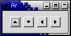
Here's a brief example to illustrate their use.
program ArrowExample;

uses gtk2, glib2;

{ Create an Arrow widget with the specified parameters and pack it into a
  button.  Return new arrow button to caller. }

function create_arrow_button (arrow_type : TGtkArrowType;
                              shadow_type : TGtkShadowType) : PGtkWidget;
var
   button, arrow : PGtkWidget;
begin
   button := gtk_button_new();
   arrow := gtk_arrow_new(arrow_type, shadow_type);

   gtk_container_add(GTK_CONTAINER(button), arrow);

   gtk_widget_show(button);
   gtk_widget_show(arrow);

   create_arrow_button := button;
end;

var
   window, button, box : PGtkWidget;

begin
   { Initialize the toolkit }
   gtk_init(@argc, @argv);

   { Create a new window }
   window := gtk_window_new(GTK_WINDOW_TOPLEVEL);

   gtk_window_set_title(GTK_WINDOW(window), 'Arrow Buttons');

   { It's a good idea to do this for all windows. }
   g_signal_connect(window, 'destroy',
                    G_CALLBACK(@gtk_main_quit), nil);

   { Set the border width of the window. }
   gtk_container_set_border_width(GTK_CONTAINER(window), 10);

   { Create a box to hold the arrows/buttons }
   box := gtk_hbox_new(FALSE, 0);
   gtk_container_set_border_width(GTK_CONTAINER(box), 2);
   gtk_container_add(GTK_CONTAINER(window), box);

   { Pack and show all our widgets }
   gtk_widget_show(box);

   button := create_arrow_button(GTK_ARROW_UP, GTK_SHADOW_IN);
   gtk_box_pack_start(GTK_BOX(box), button, false, false, 3);

   button := create_arrow_button(GTK_ARROW_DOWN, GTK_SHADOW_OUT);
   gtk_box_pack_start(GTK_BOX(box), button, false, false, 3);

   button := create_arrow_button(GTK_ARROW_LEFT, GTK_SHADOW_ETCHED_IN);
   gtk_box_pack_start(GTK_BOX(box), button, false, false, 3);

   button := create_arrow_button(GTK_ARROW_RIGHT, GTK_SHADOW_ETCHED_OUT);
   gtk_box_pack_start(GTK_BOX(box), button, false, false, 3);

   gtk_widget_show(window);

   { Rest in gtk_main and wait for the fun to begin! }
   gtk_main();
end.
These are the little text strings that pop up when you leave your pointer
over a button or other widget for a few seconds. They are easy to use,
so I will just explain them without giving an example. If you want to see some code, take a look at the testgtk.c program distributed with
GTK.
Widgets that don't receive events (widgets that don't have their own window) won't work with tooltips.
The first call you will use creates a new tooltip. You only need to do
this once for a set of tooltips as the GtkTooltips object
this function returns can be used to create multiple tooltips.
function gtk_tooltips_new () : PGtkToolTips;
Once you have created a new tooltip, and the widget you wish to use it on, simply use this call to set it:
procedure gtk_tooltips_set_tip (tooltips : PGtkTooltips;
                                widget : PGtkWidget;
                                tip_text : pgchar;
                                tip_private : pgchar);
The first argument is the tooltip you've already created, followed
by the widget you wish to have this tooltip pop up for, and the text
you wish it to say. The last argument is a text string that can be used
as an identifier when using GtkTipsQuery()
to implement context sensitive help. For now, you can set it to
nil.
Here's a short example:
var
   tooltips : PGtkTooltips;
   button : PGtkWidget;

begin
   tooltips := gtk_tooltips_new();
   button := gtk_button_new_with_label('button 1');
   .
   .
   .
   gtk_tooltips_set_tip(tooltips, button, 'This is button 1', nil);
   .
   .
   .
end.
There are other calls that can be used with tooltips. I will just list them with a brief description of what they do.
procedure gtk_tooltips_enable (tooltips : PGtkTooltips);
Enable a disabled set of tooltips.
procedure gtk_tooltips_disable (tooltips : PGtkTooltips);
Disable an enabled set of tooltips.
And that's all the functions associated with tooltips. More than you'll ever want to know :-)
Progress bars are used to show the status of an operation. They are pretty easy to use, as you will see with the code below. But first lets start out with the calls to create a new progress bar.
function gtk_progress_bar_new () : PGtkWidget;
Now that the progress bar has been created we can use it.
procedure gtk_progress_bar_set_fraction (pbar : PGtkProgressBar ;
                                         fraction : gdouble);
The first argument is the progress bar you wish to operate on, and the second argument is the amount "completed", meaning the amount the progress bar has been filled from 0-100%. This is passed to the procedure as a real number ranging from 0 to 1.
GTK v1.2 has added new functionality to the progress bar that enables it to display its value in different ways, and to inform the user of its current value and its range.
A progress bar may be set to one of a number of orientations using the procedure:
procedure gtk_progress_bar_set_orientation (pbar : PGtkProgressBar;
                                            orientation : TGtkProgressBarOrientation);
The orientation argument may take one of the following values to indicate the direction in which the progress bar moves:
GTK_PROGRESS_LEFT_TO_RIGHT
GTK_PROGRESS_RIGHT_TO_LEFT
GTK_PROGRESS_BOTTOM_TO_TOP
GTK_PROGRESS_TOP_TO_BOTTOM
As well as indicating the amount of progress that has occured, the progress bar may be set to just indicate that there is some activity. This can be useful in situations where progress cannot be measured against a value range.The following procedure indicates that some progress has been made.
procedure gtk_progress_bar_pulse (progress : PGtkProgressBar);
The step size of the activity indicator is set using the following procedure.
procedure gtk_progress_bar_set_pulse_step (pbar : PGtkProgressBar;
                                           fraction : gdouble);
When not in activity mode, the progress bar can also display a configurable text string within its trough, using the following procedure.
procedure gtk_progress_bar_set_text (progress : PGtkProgressBar;
                                     text : pgchar);
Note that gtk_progress_set_text() doesn't support the printf()-like formatting of the GTK+ 1.2 Progressbar.
You can turn off the display of the string by calling gtk_progess_bar_set_text() again with nil as second argument.
The current text setting of a progressbar can be retrieved with the following function. Do not free the returned string.
function gtk_progress_bar_get_current_text (pbar PGtkProgressBar) : pgchar;
Progress Bars are usually used with timeouts or other such functions
(see section on Timeouts, IO and Idle Functions)
to give the illusion of multitasking. All will employ the
gtk_progress_bar_set_fraction() or
gtk_progress_bar_pulse() procedures in the same manner.
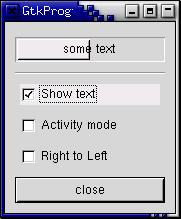
Here is an example of the progress bar, updated using timeouts. This code
also shows you how to reset the Progress Bar.
program ProgressBar;

{$mode objfpc}

uses glib2, gtk2, gdk2;

type
   TProgressData  = record
                       window        : PGtkWidget;
                       pbar          : PGtkWidget;
                       timer         : integer;
                       activity_mode : boolean;
                    end;
   PProgressData = ^TProgressData;

{ Update the value of the progress bar so that we get some movement }

function progress_timeout (data : gpointer) : LongBool; cdecl;
var
   pdata   : PProgressData;
   new_val : gdouble;
begin
   pdata := PProgressData(data);

   if pdata^.activity_mode then
      gtk_progress_bar_pulse(GTK_PROGRESS_BAR(pdata^.pbar))
   else
   begin
      { Calculate the value of the progress bar using the pointer
        value range set in the adjustment object }
      new_val := gtk_progress_bar_get_fraction(GTK_PROGRESS_BAR(pdata^.pbar)) + 0.01;

      if (new_val > 1.0) then
         new_val := 0.0;

      { Set the new value }
      gtk_progress_bar_set_fraction(GTK_PROGRESS_BAR(pdata^.pbar), new_val);
   end;

   { As this is a timeout function, return TRUE so that
     it continues to get called }
   progress_timeout := true;
end;

{ Callback that toggles the text display within the progress bar trough }

procedure toggle_show_text (widget : PGtkWidget; pdata : PProgressData); cdecl;
var
   text : pgchar;
begin
   text := gtk_progress_bar_get_text(GTK_PROGRESS_BAR(pdata^.pbar));
   if (text <> nil) and (Length(text) > 0) then
      gtk_progress_bar_set_text(GTK_PROGRESS_BAR(pdata^.pbar), '')
   else
      gtk_progress_bar_set_text(GTK_PROGRESS_BAR(pdata^.pbar), 'some text');
end;

{ Callback that toggles the activity mode of the progress bar }

procedure toggle_activity_mode (widget : PGtkWidget;
                                pdata : PProgressData); cdecl;
begin
   pdata^.activity_mode := not pdata^.activity_mode;
   if pdata^.activity_mode then
      gtk_progress_bar_pulse(GTK_PROGRESS_BAR(pdata^.pbar))
   else
      gtk_progress_bar_set_fraction(GTK_PROGRESS_BAR(pdata^.pbar), 0.0);
end;

{ Callback that toggles the orientation of the progress bar }

procedure toggle_orientation (widget : PGtkWidget;
                              pdata : PProgressData); cdecl;
begin
   case gtk_progress_bar_get_orientation(GTK_PROGRESS_BAR(pdata^.pbar)) of
     GTK_PROGRESS_LEFT_TO_RIGHT :
     gtk_progress_bar_set_orientation(GTK_PROGRESS_BAR(pdata^.pbar),
                                      GTK_PROGRESS_RIGHT_TO_LEFT);
     GTK_PROGRESS_RIGHT_TO_LEFT :
     gtk_progress_bar_set_orientation(GTK_PROGRESS_BAR(pdata^.pbar),
                                      GTK_PROGRESS_LEFT_TO_RIGHT);
     {default : do nothing }
   end;
end;

{ Clean up allocated memory and remove the timer }

procedure destroy_progress (widget : PGtkObject; pdata : PProgressData); cdecl;
begin
   g_source_remove(pdata^.timer);
   pdata^.timer := 0;
   pdata^.window := nil;
   dispose(pdata);
   gtk_main_quit();
end;

var
   pdata : PProgressData;
   align, separator, table, button, check, vbox : PGtkWidget;

begin
   gtk_init(@argc, @argv);

   { Allocate memory for the data that is passed to the callbacks }
   pdata := new(PProgressData);
   pdata^.window := gtk_window_new(GTK_WINDOW_TOPLEVEL);
   gtk_window_set_resizable(GTK_WINDOW(pdata^.window), true);

   g_signal_connect(pdata^.window, 'destroy',
                    G_CALLBACK(@destroy_progress), pdata);
   gtk_window_set_title(GTK_WINDOW(pdata^.window), 'GtkProgressBar');
   gtk_container_set_border_width(GTK_CONTAINER(pdata^.window), 0);

   vbox := gtk_vbox_new(false, 5);
   gtk_container_set_border_width(GTK_CONTAINER(vbox), 10);
   gtk_container_add(GTK_CONTAINER(pdata^.window), vbox);
   gtk_widget_show(vbox);

   { Create a centering alignment object }
   align := gtk_alignment_new(0.5, 0.5, 0, 0);
   gtk_box_pack_start(GTK_BOX(vbox), align, false, false, 5);
   gtk_widget_show(align);

   { Create the GtkProgressBar }
   pdata^.pbar := gtk_progress_bar_new();
   pdata^.activity_mode := false;

   gtk_container_add(GTK_CONTAINER(align), pdata^.pbar);
   gtk_widget_show(pdata^.pbar);

   { Add a timer callback to update the value of the progress bar }
   pdata^.timer := g_timeout_add(100, @progress_timeout, pdata);

   separator := gtk_hseparator_new();
   gtk_box_pack_start(GTK_BOX(vbox), separator, false, false, 0);
   gtk_widget_show(Separator);

   { rows, columns, homogeneous }
   table := gtk_table_new(2, 3, false);
   gtk_box_pack_start(GTK_BOX(vbox), table, false, true, 0);
   gtk_widget_show(table);

   { Add a check button to select displaying of the trough text }
   check := gtk_check_button_new_with_label('Show text');
   gtk_table_attach(GTK_TABLE(table), check, 0, 1, 0, 1,
                    GTK_EXPAND or GTK_FILL, GTK_EXPAND or GTK_FILL, 5, 5);
   g_signal_connect(check, 'clicked',
                    G_CALLBACK(@toggle_show_text), pdata);
   gtk_widget_show(check);

   { Add a check button to toggle activity mode }
   check := gtk_check_button_new_with_label('Activity mode');
   gtk_table_attach(GTK_TABLE(table), check, 0, 1, 1, 2,
                    GTK_EXPAND or GTK_FILL, GTK_EXPAND or GTK_FILL, 5, 5);
   g_signal_connect(check, 'clicked',
                    G_CALLBACK(@toggle_activity_mode), pdata);
   gtk_widget_show(check);

   { Add a check button to toggle orientation }
   check := gtk_check_button_new_with_label('Right to Left');
   gtk_table_attach(GTK_TABLE(table), check, 0, 1, 2, 3,
                    GTK_EXPAND or GTK_FILL, GTK_EXPAND or GTK_FILL, 5, 5);
   g_signal_connect(check, 'clicked',
                    G_CALLBACK(@toggle_orientation), pdata);
   gtk_widget_show(check);

   { Add a button to exit the program }
   button := gtk_button_new_with_label('close');
   g_signal_connect_swapped(button, 'clicked',
                            G_CALLBACK(@gtk_widget_destroy),
                            pdata^.window);
   gtk_box_pack_start(GTK_BOX(vbox), button, false, false, 0);

   { This makes it so the button is the default. }
   GTK_WIDGET_SET_FLAGS(button, GTK_CAN_DEFAULT);

   { This grabs this button to be the default button. Simply hitting
     the Enter key will cause this button to activate. }
   gtk_widget_grab_default(button);
   gtk_widget_show(button);

   gtk_widget_show(pdata^.window);

   gtk_main();
end.
The Dialog widget is very simple, and is actually just a window with a few things pre-packed into it for you. The structure of a Dialog is:
type
   GtkDialog = RECORD
      window : GtkWindow;
      vbox : PGtkWidget;
      action_area : PGtkWidget;
   end;
So you see, it simply creates a window, and then packs a vbox into the top, which contains a separator and then an hbox called the "action_area".
The Dialog widget can be used for pop-up messages to the user, and other similar tasks. There are two functions to create a new Dialog.
function gtk_dialog_new () : PGtkWidget;

function gtk_dialog_new_with_buttons (title : pgchar;
                                      parent : PGtkWindow;
                                      flags : GtkDialogFlags;
                                      first_button_text : pgchar;
                                      ...;
                                      nil) : PGtkWidget;
The first function will create an empty dialog, and it is now up to you to use it. You could pack a button in the action_area by doing something like this:
   button:= ...
   gtk_box_pack_start(GTK_BOX(GTK_DIALOG(window)^.action_area),
                      button, true, true, 0);
   gtk_widget_show(button);
And you could add to the vbox area by packing, for instance, a label in it, try something like this:
   a_label := gtk_label_new('Dialogs are groovy');
   gtk_box_pack_start(GTK_BOX(GTK_DIALOG(window)^.vbox),
                      a_label, true, true, 0);
   gtk_widget_show(a_label);
As an example in using the dialog box, you could put two buttons in the action_area, a Cancel button and an Ok button, and a label in the vbox area, asking the user a question or giving an error etc. Then you could attach a different signal to each of the buttons and perform the operation the user selects.
If the simple functionality provided by the default vertical and horizontal boxes in the two areas doesn't give you enough control for your application, then you can simply pack another layout widget into the boxes provided. For example, you could pack a table into the vertical box.
The more complicated _new_with_buttons() variant allows to set one or more of the following flags.
GTK_DIALOG_MODAL
make the dialog modal.
GTK_DIALOG_DESTROY_WITH_PARENT
ensures that the dialog window is destroyed together with the specified parent.
GTK_DIALOG_NO_SEPARATOR
omits the separator between the vbox and the action_area.
Pixmaps are data structures that contain pictures. These pictures can be used in various places, but most commonly as icons on the X desktop, or as cursors.
A pixmap which only has two colors is called a bitmap, and there are a few additional routines for handling this common special case.

| Warning: Pixmaps are lifted from X-Windows and are slowly drifting to the depreceted status. Pixbufs are more universal and should be used instead. |
To understand pixmaps, it would help to understand how X window system works. Under X, applications do not need to be running on the same computer that is interacting with the user. Instead, the various applications, called clients, all communicate with a program which displays the graphics and handles the keyboard and mouse. This program which interacts directly with the user is called a display server or X server. Since the communication might take place over a network, it's important to keep some information with the X server. Pixmaps, for example, are stored in the memory of the X server. This means that once pixmap values are set, they don't need to keep getting transmitted over the network; instead a command is sent to display pixmap number XYZ here. Even if you aren't using X with GTK currently, using constructs such as Pixmaps will make your programs work acceptably under X.
To use pixmaps in GTK, we must first build a GdkPixmap structure using routines from the GDK layer. Pixmaps can either be created from in-memory data, or from data read from a file. We'll go through each of the calls to create a pixmap.
function gdk_bitmap_create_from_data (window : PGdkWindow;
                                      data : pgchar;
                                      width : gint;
                                      height : gint) : PGdkPixmap;
This routine is used to create a single-plane pixmap (two colors) from data in memory. Each bit of the data represents whether that pixel is off or on. Width and height are in pixels. The GdkWindow pointer is to the current window, since a pixmap's resources are meaningful only in the context of the screen where it is to be displayed.
function gdk_pixmap_create_from_data (window : PGdkWindow;
                                      data : pgchar;
                                      width : gint;
                                      height : gint;
                                      depth : gint;
                                      fg : PGdkColor;
                                      bg : PGdkColor) : PGdkPixmap;
This is used to create a pixmap of the given depth (number of colors)
from the bitmap data specified. fg and bg are
the foreground and background color to use.
function gdk_pixmap_create_from_xpm (window : Pgdkwindow;
                                     mask : ^PGdkBitmap;
                                     transparent_color : PGdkColor;
                                     filename : pgchar) : PGdkPixmap;
The XPM format is a readable pixmap representation for the X Window System. It is widely used and many different utilities are available for creating image files in this format. The file specified by filename must contain an image in that format and it is loaded into the pixmap structure. The mask specifies which bits of the pixmap are opaque. All other bits are colored using the color specified by transparent_color. An example using this follows below.
function gdk_pixmap_create_from_xpm_d (window : PGdkWindow;
                                       mask : ^PGdkBitmap;
                                       transparent_color : PGdkColor;
                                       data : ^pgchar) : PGdkPixmap;
Small images can be incorporated into a program as data in the XPM format. A pixmap is created using this data, instead of reading it from a file. An example of such data is
{ XPM data }
const
   xpm_data : array [0..19] of pchar =
   ('16 16 3 1',
    '  c None',
    '. c #000000000000',
    'X c #FFFFFFFFFFFF',
    '           ',
    ' ......    ',
    ' .XXX.X.   ',
    ' .XXX.XX.  ',
    ' .XXX.XXX. ',
    ' .XXX..... ',
    ' .XXXXXXX. ',
    ' .XXXXXXX. ',
    ' .XXXXXXX. ',
    ' .XXXXXXX. ',
    ' .XXXXXXX. ',
    ' .XXXXXXX. ',
    ' .XXXXXXX. ',
    ' ......... ',
    '           ',
    '           ');
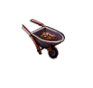
You should see the resemblence between the above and the image it produces on this button:
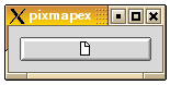
This is the pixmap button produced by the example program that follows shortly.
When we're done using a pixmap and not likely to reuse it again soon,
it is a good idea to release the resource using g_object_unref().
Pixmaps should be considered
a precious resource, because they take up memory in the end-user's X server
process. Even though the X client you write may run on a powerful server
computer, the user may be running the X server on a small personal computer.
Once we've created a pixmap, we can display it as a GTK widget. We must create a GTK image widget to contain the GDK pixmap. This is done using
function gtk_image_new_from_pixmap (pixmap : PGdkPixmap;
                                    mask : PGdkPixmap) : PGtkWidget;
The other image widget calls are
function gtk_image_get_storage_type (image : PGtkImage) : TGtkImageType;

procedure gtk_image_set_from_pixmap (image : PGtkImage;
                                     val : PGdkPixmap;
                                     mask : PGdkPixmap);

procedure gtk_image_get_pixmap (image : PGtkImage;
                                val^ : PGdkPixmap;
                                mask^ : PGdkPixmap);
gtk_pixmap_set_from_pixmap() is used
to change the pixmap that the widget is currently managing. val
is the pixmap created using GDK.
The following is an example of using a pixmap in a button.
program PixmapExample;

uses glib2, gdk2, gtk2;

{ XPM data of Open-File icon }

const
  xpm_data : array [0..19] of pchar =
   ('16 16 3 1',
    '       c None',
    '.      c #000000000000',
    'X      c #FFFFFFFFFFFF',
    '                ',
    '   ......       ',
    '   .XXX.X.      ',
    '   .XXX.XX.     ',
    '   .XXX.XXX.    ',
    '   .XXX.....    ',
    '   .XXXXXXX.    ',
    '   .XXXXXXX.    ',
    '   .XXXXXXX.    ',
    '   .XXXXXXX.    ',
    '   .XXXXXXX.    ',
    '   .XXXXXXX.    ',
    '   .XXXXXXX.    ',
    '   .........    ',
    '                ',
    '                ');

{ When invoked (via signal delete_event), terminates the application. }

function close_application (widget : PGtkWidget; event: PGdkEvent;
                            data : pgpointer) : boolean; cdecl;
begin
   gtk_main_quit();
   close_application := false;
end;

{ Is invoked when the button is clicked.  It just prints a message. }

procedure button_clicked (widget : PGtkWidget; data: gpointer); cdecl;
begin
   writeln('button clicked');
end;

var
   window, image, button : PGtkWidget;
   pixmap : PGdkPixmap;
   mask : PGdkBitmap;
   style : PGtkStyle;

begin
   { Create the main window, and attach delete_event signal to terminate
     the application }
   gtk_init( @argc, @argv );
   window := gtk_window_new(GTK_WINDOW_TOPLEVEL);
   g_signal_connect(G_OBJECT (window), 'delete_event',
                    G_CALLBACK(@close_application), nil);
   gtk_container_set_border_width(GTK_CONTAINER (window), 10);
   gtk_widget_show(window);

   { Now for the pixmap from gdk }
   style := gtk_widget_get_style(window);
   pixmap := gdk_pixmap_create_from_xpm_d(window^.window, mask,
                                          @style^.bg[GTK_STATE_NORMAL],
                                          ppgchar(xpm_data));

   { An image widget to contain the pixmap }
   image := gtk_image_new_from_pixmap(pixmap, mask);
   gtk_widget_show(image);

   { A button to contain the pixmap }
   button := gtk_button_new();
   gtk_container_add(GTK_CONTAINER(button), image);
   gtk_container_add(GTK_CONTAINER(window), button);
   gtk_widget_show(button);

   g_signal_connect(G_OBJECT(button), 'clicked',
                    G_CALLBACK(@button_clicked), nil);

   { Show the window }
   gtk_main();
end.
To load a file from an XPM data file called icon0.xpm in the current directory, we would have created the pixmap thus
   { Load a pixmap from a file }
   pixmap := gdk_pixmap_create_from_xpm(window^.window, mask,
                                        @style^.bg[GTK_STATE_NORMAL],
                                        './icon0.xpm');
   image := gtk_image_new_from_pixmap(pixmap, mask);
   gtk_widget_show(image);
   gtk_container_add(GTK_CONTAINER(window), image);
A disadvantage of using pixmaps is that the displayed object is always rectangular, regardless of the image. We would like to create desktops and applications with icons that have more natural shapes. For example, for a game interface, we would like to have round buttons to push. The way to do this is using shaped windows.
A shaped window is simply a pixmap where the background pixels are transparent. This way, when the background image is multi-colored, we don't overwrite it with a rectangular, non-matching border around our icon. The following example displays a full wheelbarrow image on the desktop. This is what it looks like on a white desktop:
program Wheelbarrow;

uses glib2, gdk2, gtk2;

{ XPM }

const
   WheelbarrowFull_xpm : array [0..112] of pchar =
   ('48 48 64 1',
    '       c None',
    '.      c #DF7DCF3CC71B',
    'X      c #965875D669A6',
    'o      c #71C671C671C6',
    'O      c #A699A289A699',
    '+      c #965892489658',
    '@      c #8E38410330C2',
    '#      c #D75C7DF769A6',
    '$      c #F7DECF3CC71B',
    '%      c #96588A288E38',
    '&      c #A69992489E79',
    '*      c #8E3886178E38',
    '=      c #104008200820',
    '-      c #596510401040',
    ';      c #C71B30C230C2',
    ':      c #C71B9A699658',
    '>      c #618561856185',
    ',      c #20811C712081',
    '<      c #104000000000',
    '1      c #861720812081',
    '2      c #DF7D4D344103',
    '3      c #79E769A671C6',
    '4      c #861782078617',
    '5      c #41033CF34103',
    '6      c #000000000000',
    '7      c #49241C711040',
    '8      c #492445144924',
    '9      c #082008200820',
    '0      c #69A618611861',
    'q      c #B6DA71C65144',
    'w      c #410330C238E3',
    'e      c #CF3CBAEAB6DA',
    'r      c #71C6451430C2',
    't      c #EFBEDB6CD75C',
    'y      c #28A208200820',
    'u      c #186110401040',
    'i      c #596528A21861',
    'p      c #71C661855965',
    'a      c #A69996589658',
    's      c #30C228A230C2',
    'd      c #BEFBA289AEBA',
    'f      c #596545145144',
    'g      c #30C230C230C2',
    'h      c #8E3882078617',
    'j      c #208118612081',
    'k      c #38E30C300820',
    'l      c #30C2208128A2',
    'z      c #38E328A238E3',
    'x      c #514438E34924',
    'c      c #618555555965',
    'v      c #30C2208130C2',
    'b      c #38E328A230C2',
    'n      c #28A228A228A2',
    'm      c #41032CB228A2',
    'M      c #104010401040',
    'N      c #492438E34103',
    'B      c #28A2208128A2',
    'V      c #A699596538E3',
    'C      c #30C21C711040',
    'Z      c #30C218611040',
    'A      c #965865955965',
    'S      c #618534D32081',
    'D      c #38E31C711040',
    'F      c #082000000820',
    '                                                ',
    '          .XoO                                  ',
    '         +@#$%o&                                ',
    '         *=-;#::o+                              ',
    '           >,<12#:34                            ',
    '             45671#:X3                          ',
    '               +89<02qwo                        ',
    'e*                >,67;ro                       ',
    'ty>                459@>+&&                     ',
    '$2u+                  >                ',
    'Oh$;ya             *3d.a8j,Xe.d3g8+             ',
    ' Oh$;ka          *3d$a8lz,,xxc:.e3g54           ',
    '  Oh$;kO       *pd$%svbzz,sxxxxfX..&wn>         ',
    '   Oh$@mO    *3dthwlsslszjzxxxxxxx3:td8M4       ',
    '    Oh$@g& *3d$XNlvvvlllm,mNwxxxxxxxfa.:,B*     ',
    '     Oh$@,Od.czlllllzlmmqV@V#V@fxxxxxxxf:%j5&   ',
    '      Oh$1hd5lllslllCCZrV#r#:#2AxxxxxxxxxcdwM*  ',
    '       OXq6c.%8vvvllZZiqqApA:mq:Xxcpcxxxxxfdc9* ',
    '        2r<6gde3bllZZrVi7S@SV77A::qApxxxxxxfdcM ',
    '        :,q-6MN.dfmZZrrSS:#riirDSAX@Af5xxxxxfevo',
    '         +A26jguXtAZZZC7iDiCCrVVii7Cmmmxxxxxx%3g',
    '          *#16jszN..3DZZZZrCVSA2rZrV7Dmmwxxxx&en',
    '           p2yFvzssXe:fCZZCiiD7iiZDiDSSZwwxx8e*>',
    '           OA1666     >=01-kuu666>        ',
    '                 ,6ky&      &46-10ul,66,        ',
    '                 Ou0<>       o66y66By7=xu664       ',
    '                   <>       +66uv,zN666*       ',
    '                              566,xxj669        ',
    '                              4666FF666>        ',
    '                               >966666M         ',
    '                                oM6668+         ',
    '                                  *4            ',
    '                                                ',
    '                                                ');

{ When invoked (via signal delete_event), terminates the application. }

function close_application (widget : PGtkWidget; event : PGdkEvent;
                            data : gpointer) : boolean; cdecl;
begin
   gtk_main_quit();
   close_application := false;
end;

var
   window, image, fixed : PGtkWidget;
   gdk_pixmap : PGdkPixmap;
   mask : PGdkBitmap;
   style : PGtkStyle;

begin
   { Create the main window, and attach delete_event signal to terminate
     the application.  Note that the main window will not have a titlebar
     since we're making it a popup.}
   gtk_init(@argc, @argv);
   window := gtk_window_new(GTK_WINDOW_POPUP);

   { Make the wheelbarrow image sensitive to a mouse button being pressed
     and make the application terminate. }
   g_signal_connect(G_OBJECT(window), 'button-press-event',
                    G_CALLBACK(@close_application), nil);
   gtk_widget_set_events(window, GDK_BUTTON_PRESS_MASK);
   gtk_widget_realize(window);

   { Now for the pixmap and the image widget}
   style := gtk_widget_get_default_style();
   gdk_pixmap := gdk_pixmap_create_from_xpm_d(window^.window, mask,
                                              @style^.bg[GTK_STATE_NORMAL],
                                              WheelbarrowFull_xpm);
   image := gtk_image_new_from_pixmap(gdk_pixmap, mask);
   gtk_widget_show(image);

   { To display the pixmap, we use a fixed widget to place the pixmap }
   fixed := gtk_fixed_new();
   gtk_widget_set_size_request(fixed, 200, 200);
   gtk_fixed_put(GTK_FIXED(fixed), image, 0, 0);
   gtk_container_add(GTK_CONTAINER(window), fixed);
   gtk_widget_show(fixed);

   { This masks out everything except for the image itself }
   gtk_widget_shape_combine_mask(window, mask, 0, 0);

   { Show the window }
   gtk_window_set_position(GTK_WINDOW(window), GTK_WIN_POS_CENTER);
   gtk_widget_show(window);
   gtk_main();
end.
To terminate the application mouse-click on the wheelbarrow image.
Ruler widgets are used to indicate the location of the mouse pointer in a given window. A window can have a vertical ruler spanning across the height and a horizontal ruler spanning down the width. A small triangular indicator on the ruler shows the exact location of the pointer relative to the ruler.
A ruler must first be created. Horizontal and vertical rulers are created using
function gtk_hruler_new () : PGtkWidget;   { horizontal ruler }

function gtk_vruler_new () : PGtkWidget;   { vertical ruler }
Once a ruler is created, we can define the unit of measurement. Units
of measure for rulers can be GTK_PIXELS,
GTK_INCHES or GTK_CENTIMETERS. This is set using
procedure gtk_ruler_set_metric (ruler : PGtkRuler;
                                metric : TGtkMetricType);
The default measure is GTK_PIXELS.
gtk_ruler_set_metric(GTK_RULER(ruler), GTK_PIXELS);
Other important characteristics of a ruler are how to mark the units of scale and where the position indicator is initially placed. These are set for a ruler using
procedure gtk_ruler_set_range (ruler : PGtkRuler;
                               lower : gdouble;
                               upper : gdouble;
                               position : gdouble;
                               max_size : gdouble);
The lower and upper arguments define the extent
of the ruler, and max_size is the largest possible number that
will be displayed. Position defines the initial position of the pointer
indicator within the ruler.
A vertical ruler can span an 800 pixel wide window thus
gtk_ruler_set_range(GTK_RULER(vruler), 0, 800, 0, 800);
The markings displayed on the ruler will be from 0 to 800, with a number for every 100 pixels. If instead we wanted the ruler to range from 7 to 16, we would code
gtk_ruler_set_range(GTK_RULER(vruler), 7, 16, 0, 20);
The indicator on the ruler is a small triangular mark that indicates
the position of the pointer relative to the ruler. If the ruler is used
to follow the mouse pointer, the motion_notify_event signal
should be connected to the motion_notify_event() method of
the ruler. To follow all mouse movements within a window area, we would use
#define EVENT_METHOD(i, x) GTK_WIDGET_GET_CLASS(i)^.x

   gtk_signal_connect_swapped(area, 'motion_notify_event',
                              G_CALLBACK(EVENT_METHOD(ruler, motion_notify_event)),
                              ruler);
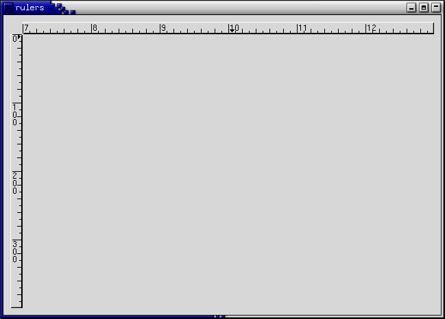
The following example creates a drawing area with a horizontal ruler above it and a vertical ruler to the left of it. The size of the drawing area is 600 pixels wide by 400 pixels high. The horizontal ruler spans from 7 to 13 with a mark every 100 pixels, while the vertical ruler spans from 0 to 400 with a mark every 100 pixels. Placement of the drawing area and the rulers is done using a table.
program Rulers;

uses glib2, gdk2, gtk2;

const
   XSIZE = 600;
   YSIZE = 400;

{ This routine gets control when the close button is clicked }

function close_application (widget : PGtkWidget;
                            event : PGdkEvent;
                            data : gpointer) : boolean; cdecl;
begin
   gtk_main_quit();
   close_application := false;
end;

var
   window, table, area, hrule, vrule : PGtkWidget;

begin
   { Initialize GTK and create the main window }
   gtk_init(@argc, @argv);

   window := gtk_window_new(GTK_WINDOW_TOPLEVEL);
   g_signal_connect(window, 'delete-event',
                    G_CALLBACK(@close_application), nil);
   gtk_container_set_border_width(GTK_CONTAINER(window), 10);

   { Create a table for placing the ruler and the drawing area }
   table := gtk_table_new(3, 2, false);
   gtk_container_add(GTK_CONTAINER(window), table);

   area := gtk_drawing_area_new();
   gtk_widget_set_size_request(GTK_WIDGET(area), XSIZE, YSIZE);
   gtk_table_attach(GTK_TABLE(table), area, 1, 2, 1, 2,
                    GTK_EXPAND or GTK_FILL, GTK_FILL, 0, 0);
   gtk_widget_set_events(area,
                         GDK_POINTER_MOTION_MASK or GDK_POINTER_MOTION_HINT_MASK);

   { The horizontal ruler goes on top. As the mouse moves across
     the drawing area, a motion_notify_event is passed to the appropriate
     event handler for the ruler. }
   hrule := gtk_hruler_new();
   gtk_ruler_set_metric(GTK_RULER(hrule), GTK_PIXELS);
   gtk_ruler_set_range(GTK_RULER(hrule), 7, 13, 0, 20);
   g_signal_connect_swapped(area, 'motion_notify_event',
	                    G_CALLBACK(GTK_WIDGET_GET_CLASS(hrule)^.motion_notify_event),
                            hrule);
   gtk_table_attach(GTK_TABLE(table), hrule, 1, 2, 0, 1,
		    GTK_EXPAND or GTK_SHRINK  or GTK_FILL, GTK_FILL, 0, 0);

   { The vertical ruler goes on the left. As the mouse moves across
     the drawing area, a motion_notify_event is passed
     to the appropriate event handler for the ruler. }
   vrule := gtk_vruler_new();
   gtk_ruler_set_metric(GTK_RULER(vrule), GTK_PIXELS);
   gtk_ruler_set_range(GTK_RULER(vrule), 0, YSIZE, 10, YSIZE);
   g_signal_connect_swapped(area, 'motion_notify_event',
	                    G_CALLBACK(GTK_WIDGET_GET_CLASS(vrule)^.motion_notify_event),
                            vrule);
   gtk_table_attach(GTK_TABLE(table), vrule, 0, 1, 1, 2,
		    GTK_FILL, GTK_EXPAND or GTK_SHRINK or GTK_FILL, 0, 0);

   { Now show everything }
   gtk_widget_show(area);
   gtk_widget_show(hrule);
   gtk_widget_show(vrule);
   gtk_widget_show(table);
   gtk_widget_show(window);
   gtk_main();
end.
Statusbars are simple widgets used to display a text message. They keep a stack of the messages pushed onto them, so that popping the current message will re-display the previous text message.
In order to allow different parts of an application to use the same statusbar to display messages, the statusbar widget issues Context Identifiers which are used to identify different "users". The message on top of the stack is the one displayed, no matter what context it is in. Messages are stacked in last-in-first-out order, not context identifier order.
A statusbar is created with a call to:
function gtk_statusbar_new () : PGtkWidget;
A new Context Identifier is requested using a call to the following function with a short textual description of the context:
function gtk_statusbar_get_context_id (statusbar : PGtkStatusbar;
                                       context_description : pgchar) : guint;
There are two procedures and one function that can operate on statusbars:
function gtk_statusbar_push (statusbar : PGtkStatusbar;
                             context_id : guint;
                             text : pgpointer) : guint;

procedure gtk_statusbar_pop (statusbar : PGtkStatusbar;
                             context_id : guint);

procedure gtk_statusbar_remove (statusbar : PGtkStatusbar;
                                context_id : guint;
                                message_id : guint);
The first, gtk_statusbar_push(), is used
to add a new message to the statusbar. It returns a Message Identifier,
which can be passed later to the function
gtk_statusbar_remove() to remove the message
with the given Message and Context Identifiers from the statusbar's stack.
The function gtk_statusbar_pop() removes
the message highest in the stack with the given Context Identifier.
In addition to messages, statusbars may also display a resize grip, which can be dragged with the mouse to resize the toplevel window containing the statusbar, similar to dragging the window frame. The following functions control the display of the resize grip.
procedure gtk_statusbar_set_has_resize_grip (statusbar : PGtkStatusbar;
					     setting : gboolean);

function gtk_statusbar_get_has_resize_grip (statusbar : PGtkStatusbar) : gboolean;
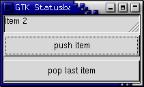
The following example creates a statusbar and two buttons, one for pushing items onto the statusbar, and one for popping the last item back off.
program Statusbar;

{$MODE objfpc}

uses glib2, gtk2;

var
    status_bar : PGtkWidget;
    count : integer = 1;

procedure push_item (widget : PGtkWidget; data : pgint); cdecl;
var
   buff : pgchar;
begin
   buff := g_strdup_printf('Item %d', count);
   Inc(count);
   gtk_statusbar_push(GTK_STATUSBAR(status_bar), data^, buff);
   g_free(buff);
end;

procedure pop_item (widget : PGtkWidget; data : pgint); cdecl;
begin
   gtk_statusbar_pop(GTK_STATUSBAR(status_bar), data^);
end;

var
   window, vbox, button : PGtkWidget;
   context_id : gint;

begin
   gtk_init(@argc, @argv);

   { Create a new window }
   window := gtk_window_new(GTK_WINDOW_TOPLEVEL);
   gtk_widget_set_size_request(GTK_WIDGET(window), 200, 100);
   gtk_window_set_title(GTK_WINDOW (window), 'GTK Statusbar Example');
   g_signal_connect(window, 'delete_event',
                    G_CALLBACK(@gtk_main_quit), nil);

   vbox := gtk_vbox_new(false, 1);
   gtk_container_add(GTK_CONTAINER(window), vbox);
   gtk_widget_show(vbox);

   status_bar := gtk_statusbar_new();
   gtk_box_pack_start(GTK_BOX (vbox), status_bar, true, true, 0);
   gtk_widget_show(status_bar);

   context_id := gtk_statusbar_get_context_id(GTK_STATUSBAR(status_bar),
                                              'Statusbar example');

   button := gtk_button_new_with_label('push item');
   g_signal_connect(button, 'clicked',
                    G_CALLBACK(@push_item), @context_id);
   gtk_box_pack_start(GTK_BOX(vbox), button, true, true, 2);
   gtk_widget_show(button);

   button := gtk_button_new_with_label('pop last item');
   g_signal_connect(button, 'clicked',
                    G_CALLBACK(@pop_item), @context_id);
   gtk_box_pack_start(GTK_BOX(vbox), button, true, true, 2);
   gtk_widget_show(button);

   { Always display the window as the last step so it all splashes on
     the screen at once. }
   gtk_widget_show(window);

   gtk_main();
end.
The Entry widget allows text to be typed and displayed in a single line text box. The text may be set with function calls that allow new text to replace, prepend or append the current contents of the Entry widget.
Create a new Entry widget with the following function.
function gtk_entry_new () : PGtkWidget;
The next procedure alters the text which is currently within the Entry widget.
procedure gtk_entry_set_text (entry : PGtkEntry;
                              text : pgchar);
The function gtk_entry_set_text() sets
the contents of the Entry widget, replacing the current contents.
Note that the class Entry implements the Editable interface (yes, gobject
supports Java-like interfaces) which contains some more functions
for manipulating the contents.
The contents of the Entry can be retrieved by using a call to the following function. This is useful in the callbacks described below.
function gtk_entry_get_text (entry : PGtkEntry) : pgchar;
The value returned by this function is used internally, and must not be freed using either dispose() or g_free().
If we don't want the contents of the Entry to be changed by someone typing into it, we can change its editable state.
procedure gtk_editable_set_editable (entry : PGtkEditable;
                                     editable : gboolean);
The procedure above allows us to toggle the editable state of the Entry
widget by passing in a true or false value
for the editable argument.
If we are using the Entry where we don't want the text entered to be visible, for example when a password is being entered, we can use the following procedure, which also takes a boolean argument.
procedure gtk_entry_set_visibility (entry : PGtkEntry;
                                    visible : gboolean);
A region of the text may be set as selected by using the following procedure. This would most often be used after setting some default text in an Entry, making it easy for the user to remove it.
procedure gtk_editable_select_region (entry : PGtkEditable;
                                      start : gint;
                                      end : gint);
If we want to catch when the user has entered text, we can connect
to the activate or changed signal. Activate is raised
when the user hits the enter key within the Entry widget. Changed is raised
when the text changes at all, e.g., for every character entered or removed.
The following code is an example of using an Entry widget.
program EntryExample;
uses glib2, gdk2, gtk2;
procedure enter_callback (widget, entry : PGtkWidget); cdecl;
var
entry_text : pgchar;
begin
entry_text := gtk_entry_get_text(GTK_ENTRY(entry));
writeln('Entry contents: ', entry_text);
end;
procedure entry_toggle_editable (checkbutton, entry: PGtkWidget); cdecl;
begin
gtk_editable_set_editable(GTK_EDITABLE(entry),
gtk_toggle_button_get_active(GTK_TOGGLE_BUTTON(checkbutton)));
end;
procedure entry_toggle_visibility (checkbutton, entry : PGtkWidget); cdecl;
begin
gtk_entry_set_visibility(GTK_ENTRY(entry),
gtk_toggle_button_get_active(GTK_TOGGLE_BUTTON(checkbutton)));
end;
var
window, vbox, hbox, entry, button, check : PGtkWidget;
tmp_pos : integer;
begin
gtk_init(@argc, @argv);
{ Create a new window }
window := gtk_window_new(gtk_WINDOW_TOPLEVEL);
gtk_widget_set_size_request(GTK_WIDGET(window), 200, 100);
gtk_window_set_title(GTK_WINDOW(window), 'Gtk Entry');
g_signal_connect(window, 'destroy',
G_CALLBACK(@gtk_main_quit), nil);
g_signal_connect_swapped(window, 'delete-event',
G_CALLBACK(@gtk_widget_destroy), window);
vbox := gtk_vbox_new(false, 0);
gtk_container_add(GTK_CONTAINER(window), vbox);
gtk_widget_show(vbox);
entry := gtk_entry_new();
gtk_entry_set_max_length(GTK_ENTRY(entry), 50);
g_signal_connect(entry, 'activate',
G_CALLBACK(@enter_callback), entry);
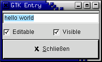
gtk_entry_set_text(GTK_ENTRY(entry), 'hello');
tmp_pos := GTK_ENTRY(entry)^.text_length;
gtk_editable_insert_text(GTK_EDITABLE(entry), ' world', -1, @tmp_pos);
gtk_editable_select_region(GTK_EDITABLE(entry), 0, tmp_pos);
gtk_box_pack_start(GTK_BOX(vbox), entry, true, true, 0);
gtk_widget_show(entry);
hbox := gtk_hbox_new(false, 0);
gtk_container_add(GTK_CONTAINER(vbox), hbox);
gtk_widget_show(hbox);
check := gtk_check_button_new_with_label('Editable');
gtk_box_pack_start(GTK_BOX(hbox), check, true, true, 0);
g_signal_connect(check, 'toggled',
G_CALLBACK(@entry_toggle_editable), entry);
gtk_toggle_button_set_active(GTK_TOGGLE_BUTTON(check), true);
gtk_widget_show(check);
check := gtk_check_button_new_with_label('Visible');
gtk_box_pack_start(GTK_BOX(hbox), check, true, true, 0);
g_signal_connect(check, 'toggled',
G_CALLBACK(@entry_toggle_visibility), entry);
gtk_toggle_button_set_active(GTK_TOGGLE_BUTTON(check), true);
gtk_widget_show(check);
button := gtk_button_new_from_stock(GTK_STOCK_CLOSE);
g_signal_connect_swapped(button, 'clicked',
G_CALLBACK(@gtk_main_quit), window);
gtk_box_pack_start(GTK_BOX(vbox), button, true, true, 0);
GTK_WIDGET_SET_FLAGS(button, GTK_CAN_DEFAULT);
gtk_widget_grab_default(button);
gtk_widget_show(button);
gtk_widget_show(window);
gtk_main();
end.
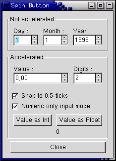
The Spin Button widget is generally used to allow the user to select a value from a range of numeric values. It consists of a text entry box with up and down arrow buttons attached to the side. Selecting one of the buttons causes the value to "spin" up and down the range of possible values. The entry box may also be edited directly to enter a specific value.
The Spin Button allows the value to have zero or a number of decimal places and to be incremented/decremented in configurable steps. The action of holding down one of the buttons optionally results in an acceleration of change in the value according to how long it is depressed.
The Spin Button uses an Adjustment object to hold information about the range of values that the spin button can take. This makes for a powerful Spin Button widget.
Recall that an adjustment widget is created with the following function, which illustrates the information that it holds:
function gtk_adjustment_new (value : gdouble;
                             lower : gdouble;
                             upper : gdouble;
                             step_increment : gdouble;
                             page_increment : gdouble;
                             page_size : gdouble) : PGtkObject;
These attributes of an Adjustment are used by the Spin Button in the following way:
value: initial value for the Spin Button
lower: lower range value
upper: upper range value
step_increment: value to increment/decrement when pressing
mouse button 1 on a button
page_increment: value to increment/decrement when pressing
mouse button 2 on a button
page_size: unused
Additionally, mouse button 3 can be used to jump directly to the upper or lower values when used to select one of the buttons. Lets look at how to create a Spin Button:
function gtk_spin_button_new (adjustment : PGtkAdjustment;
                              climb_rate : gdouble;
                              digits : guint) : PGtkWidget
The climb_rate argument takes a value between 0.0 and 1.0
and indicates the amount of acceleration that the Spin Button has.
The digits argument specifies the number of decimal places
to which the value will be displayed.
A Spin Button can be reconfigured after creation using the following procedure:
procedure gtk_spin_button_configure (spin_button : PGtkSpinButton;
                                     adjustment : PGtkAdjustment;
                                     climb_rate : gdouble;
                                     digits : guint);
The spin_button argument specifies the Spin Button widget
that is to be reconfigured. The other arguments are as specified above.
The adjustment can be set and retrieved independently using the following procedure and function:
procedure gtk_spin_button_set_adjustment (spin_button : PGtkSpinButton;
                                          adjustment : PGtkAdjustment);

function gtk_spin_button_get_adjustment (spin_button : PGtkSpinButton) : PGtkAdjustment;
The number of decimal places can also be altered using:
procedure gtk_spin_button_set_digits (spin_button : PGtkSpinButton;
                                      digits : guint);
The value that a Spin Button is currently displaying can be changed using the following procedure:
procedure gtk_spin_button_set_value (spin_button : PGtkSpinButton;
                                     value : gdouble);
The current value of a Spin Button can be retrieved as either a floating point or integer value with the following functions:
function gtk_spin_button_get_value (spin_button : PGtkSpinButton) : gdouble;

function gtk_spin_button_get_value_as_int (spin_button : PGtkSpinButton) : gint;
If you want to alter the value of a Spin Value relative to its current value, then the following procedure can be used:
procedure gtk_spin_button_spin (spin_button : PGtkSpinButton;
                                direction : TGtkSpinType;
                                increment : gdouble);
The direction parameter can take one of the following
values:
  GTK_SPIN_STEP_FORWARD
  GTK_SPIN_STEP_BACKWARD
  GTK_SPIN_PAGE_FORWARD
  GTK_SPIN_PAGE_BACKWARD
  GTK_SPIN_HOME
  GTK_SPIN_END
  GTK_SPIN_USER_DEFINED
This function packs in quite a bit of functionality, which I will attempt to explain clearly. Many of these settings use values from the Adjustment object that is associated with a Spin Button.
GTK_SPIN_STEP_FORWARD and GTK_SPIN_STEP_BACKWARD
change the value of the Spin Button by the amount specified by increment,
unless increment is equal to 0, in which case the value is
changed by the value of step_increment in the Adjustment.
GTK_SPIN_PAGE_FORWARD and GTK_SPIN_PAGE_BACKWARD
simply alter the value of the Spin Button by increment.
GTK_SPIN_HOME sets the value of the Spin Button to the bottom
of the Adjustments range.
GTK_SPIN_END sets the value of the Spin Button to the top
of the Adjustments range.
GTK_SPIN_USER_DEFINED simply alters the value of the Spin
Button by the specified amount.
We move away from functions for setting and retrieving the range attributes of the Spin Button now, and move on to procedures that affect the appearance and behaviour of the Spin Button widget itself.
The first of these procedures is used to constrain the text box of the Spin Button such that it may only contain a numeric value. This prevents a user from typing anything other than numeric values into the text box of a Spin Button:
procedure gtk_spin_button_set_numeric (spin_button : PGtkSpinButton;
                                       numeric : gboolean);
You can set whether a Spin Button will wrap around between the upper and lower range values with the following procedure:
procedure gtk_spin_button_set_wrap (spin_button : PGtkSpinButton;
                                    wrap : gboolean);
You can set a Spin Button to round the value to the nearest
step_increment, which is set within the Adjustment object used
with the Spin Button. This is accomplished with the following procedure:
procedure gtk_spin_button_set_snap_to_ticks (spin_button : PGtkSpinButton;
                                             snap_to_ticks : gboolean);
The update policy of a Spin Button can be changed with the following procedure:
procedure gtk_spin_button_set_update_policy (spin_button : PGtkSpinButton;
                                             policy : TGtkSpinButtonUpdatePolicy);
The possible values of policy are either
GTK_UPDATE_ALWAYS or GTK_UPDATE_IF_VALID.
These policies affect the behavior of a Spin Button when parsing inserted text and syncing its value with the values of the Adjustment.
In the case of GTK_UPDATE_IF_VALID the Spin Button value only
gets changed if the text input is a numeric value that is within the range
specified by the Adjustment. Otherwise the text is reset to the current
value.
In case of GTK_UPDATE_ALWAYS we ignore errors while converting
text into a numeric value.
Finally, you can explicitly request that a Spin Button update itself:
procedure gtk_spin_button_update (spin_button : PGtkSpinButton);
It's example time again.
program Spinbutton;

uses glib2, gtk2;

const
    a : gint = 1;
    b : gint = 2;

var
   spinner1 : PGtkWidget;

function GPOINTER_TO_INT (data : pgint) : gint;
begin
    GPOINTER_TO_INT := data^;
end;

procedure toggle_snap (widget : PGtkWidget; spin : PGtkSpinButton); cdecl;
begin
   gtk_spin_button_set_snap_to_ticks(spin, gtk_toggle_button_get_active(GTK_TOGGLE_BUTTON(widget)));
end;

procedure toggle_numeric (widget : PGtkWidget; spin : PGtkSpinButton); cdecl;
begin
   gtk_spin_button_set_numeric(spin, gtk_toggle_button_get_active(GTK_TOGGLE_BUTTON(widget)));
end;

procedure change_digits (widget : PGtkWidget; spin : PGtkSpinButton); cdecl;
begin
   gtk_spin_button_set_digits(GTK_SPIN_BUTTON(spinner1),
                              gtk_spin_button_get_value_as_int(spin));
end;

procedure get_value (widget : PGtkWidget; data : gpointer); cdecl;
var
   buf : pgchar;
   a_label : PGtkLabel;
   spin : PGtkSpinButton;
begin
   spin := GTK_SPIN_BUTTON(spinner1);
   a_label := GTK_LABEL(g_object_get_data(G_OBJECT(widget), 'user_data'));
   if (GPOINTER_TO_INT(data) = 1) then
      buf := g_strdup_printf(32, '%d', gtk_spin_button_get_value_as_int(spin))
   else
      buf := g_strdup_printf(32, '%0.*f', gtk_spin_button_get_digits(spin),
                             gtk_spin_button_get_value(spin));
   gtk_label_set_text(a_label, buf {Ptr_buf});
end;

var
   window, frame, hbox, main_vbox, vbox, vbox2 : PGtkWidget;
   spinner2, spinner, button, a_label, val_label : PGtkWidget;
   adj : PGtkAdjustment;

begin
   { Initialise GTK }
   gtk_init(@argc, @argv);

   window := gtk_window_new(GTK_WINDOW_TOPLEVEL);

   g_signal_connect(window, 'destroy',
                    G_CALLBACK(@gtk_main_quit), nil);

   gtk_window_set_title(GTK_WINDOW(window), 'Spin Button');

   main_vbox := gtk_vbox_new (false, 5);
   gtk_container_set_border_width(GTK_CONTAINER(main_vbox), 10);
   gtk_container_add(GTK_CONTAINER(window), main_vbox);

   frame := gtk_frame_new('Not accelerated');
   gtk_box_pack_start(GTK_BOX(main_vbox), frame, true, true, 0);

   vbox := gtk_vbox_new(false, 0);
   gtk_container_set_border_width(GTK_CONTAINER(vbox), 5);
   gtk_container_add(GTK_CONTAINER(frame), vbox);

   { Day, month, year spinners }

   hbox := gtk_hbox_new(false, 0);
   gtk_box_pack_start(GTK_BOX(vbox), hbox, true, true, 5);

   vbox2 := gtk_vbox_new(false, 0);
   gtk_box_pack_start(GTK_BOX(hbox), vbox2, true, true, 5);

   a_label := gtk_label_new('Day :');
   gtk_misc_set_alignment(GTK_MISC(a_label), 0, 0.5);
   gtk_box_pack_start(GTK_BOX(vbox2), a_label, false, true, 0);

   adj := PGtkAdjustment(gtk_adjustment_new(1.0, 1.0, 31.0, 1.0, 5.0, 0.0));

   spinner := gtk_spin_button_new(adj, 0, 0);
   gtk_spin_button_set_wrap(GTK_SPIN_BUTTON(spinner), true);
   gtk_box_pack_start(GTK_BOX(vbox2), spinner, false, true, 0);

   vbox2 := gtk_vbox_new(false, 0);
   gtk_box_pack_start(GTK_BOX (hbox), vbox2, true, true, 5);

   a_label := gtk_label_new('Month :');
   gtk_misc_set_alignment(GTK_MISC(a_label), 0, 0.5);
   gtk_box_pack_start(GTK_BOX(vbox2), a_label, false, true, 0);

   adj := PGtkAdjustment(gtk_adjustment_new(1.0, 1.0, 12.0, 1.0, 5.0, 0.0));

   spinner := gtk_spin_button_new(adj, 0, 0);
   gtk_spin_button_set_wrap(GTK_SPIN_BUTTON(spinner), true);
   gtk_box_pack_start(GTK_BOX(vbox2), spinner, false, true, 0);

   vbox2 := gtk_vbox_new(false, 0);
   gtk_box_pack_start(GTK_BOX (hbox), vbox2, true, true, 5);

   a_label := gtk_label_new('Year :');
   gtk_misc_set_alignment(GTK_MISC(a_label), 0, 0.5);
   gtk_box_pack_start(GTK_BOX(vbox2), a_label, false, true, 0);

   adj := PGtkAdjustment(gtk_adjustment_new(1998.0, 0.0, 2100.0,
                                            1.0, 100.0, 0.0));

   spinner := gtk_spin_button_new(adj, 0, 0);
   gtk_spin_button_set_wrap (GTK_SPIN_BUTTON (spinner), false);
   gtk_widget_set_size_request(spinner, 55, -1);
   gtk_box_pack_start(GTK_BOX(vbox2), spinner, false, true, 0);

   frame := gtk_frame_new('Accelerated');
   gtk_box_pack_start(GTK_BOX(main_vbox), frame, true, true, 0);

   vbox := gtk_vbox_new(false, 0);
   gtk_container_set_border_width(GTK_CONTAINER (vbox), 5);
   gtk_container_add(GTK_CONTAINER(frame), vbox);

   hbox := gtk_hbox_new(false, 0);
   gtk_box_pack_start(GTK_BOX(vbox), hbox, false, true, 5);

   vbox2 := gtk_vbox_new(false, 0);
   gtk_box_pack_start(GTK_BOX (hbox), vbox2, true, true, 5);

   a_label := gtk_label_new ('Value :');
   gtk_misc_set_alignment (GTK_MISC (a_label), 0, 0.5);
   gtk_box_pack_start(GTK_BOX (vbox2), a_label, false, true, 0);

   adj := PGtkAdjustment(gtk_adjustment_new(0.0, -10000.0, 10000.0,
                                            0.5, 100.0, 0.0));

   spinner1 := gtk_spin_button_new(adj, 1.0, 2);
   gtk_spin_button_set_wrap(GTK_SPIN_BUTTON(spinner1), true);
   gtk_widget_set_size_request(spinner1, 100, -1);
   gtk_box_pack_start(GTK_BOX (vbox2), spinner1, false, true, 0);

   vbox2 := gtk_vbox_new(false, 0);
   gtk_box_pack_start(GTK_BOX (hbox), vbox2, true, true, 5);

   a_label := gtk_label_new('Digits :');
   gtk_misc_set_alignment(GTK_MISC (a_label), 0, 0.5);
   gtk_box_pack_start(GTK_BOX (vbox2), a_label, false, true, 0);

   adj := PGtkAdjustment(gtk_adjustment_new(2, 1, 5, 1, 1, 0));
   spinner2 := gtk_spin_button_new(adj, 0.0, 0);
   gtk_spin_button_set_wrap(GTK_SPIN_BUTTON(spinner2), true);
   g_signal_connect(adj, 'value_changed',
                    G_CALLBACK(@change_digits), spinner2);
   gtk_box_pack_start(GTK_BOX(vbox2), spinner2, false, true, 0);

   hbox := gtk_hbox_new(false, 0);
   gtk_box_pack_start(GTK_BOX(vbox), hbox, false, true, 5);

   button := gtk_check_button_new_with_label('Snap to 0.5-ticks');
   g_signal_connect(button, 'clicked',
                    G_CALLBACK(@toggle_snap), spinner1);
   gtk_box_pack_start(GTK_BOX(vbox), button, true, true, 0);
   gtk_toggle_button_set_active(GTK_TOGGLE_BUTTON(button), true);

   button := gtk_check_button_new_with_label('Numeric only input mode');
   g_signal_connect(button, 'clicked',
                    G_CALLBACK(@toggle_numeric), spinner1);
   gtk_box_pack_start(GTK_BOX(vbox), button, true, true, 0);
   gtk_toggle_button_set_active(GTK_TOGGLE_BUTTON(button), true);

   val_label := gtk_label_new ('');

   hbox := gtk_hbox_new(false, 0);
   gtk_box_pack_start(GTK_BOX(vbox), hbox, false, true, 5);
   button := gtk_button_new_with_label('Value as Int');
   g_object_set_data(G_OBJECT(button), 'user_data', val_label);
   g_signal_connect(button, 'clicked',
                    G_CALLBACK(@get_value), @a);  //!!!
   gtk_box_pack_start(GTK_BOX(hbox), button, true, true, 5);

   button := gtk_button_new_with_label('Value as Float');
   g_object_set_data(G_OBJECT(button), 'user_data', val_label);
   g_signal_connect(button, 'clicked',
                    G_CALLBACK(@get_value), @b);  //!!!
   gtk_box_pack_start(GTK_BOX(hbox), button, true, true, 5);

   gtk_box_pack_start(GTK_BOX(vbox), val_label, true, true, 0);
   gtk_label_set_text(GTK_LABEL(val_label), '0');

   hbox := gtk_hbox_new(false, 0);
   gtk_box_pack_start(GTK_BOX(main_vbox), hbox, false, true, 0);

   button := gtk_button_new_with_label('Close');
   g_signal_connect_swapped(button, 'clicked',
                            G_CALLBACK(@gtk_widget_destroy),
                            window);
   gtk_box_pack_start(GTK_BOX(hbox), button, true, true, 5);

   gtk_widget_show_all(window);

  { Enter the event loop }
  gtk_main ();
end.
The combo box is another fairly simple widget that is really just a collection of other widgets. From the user's point of view, the widget consists of a text entry box and a pull down menu from which the user can select one of a set of predefined entries. Alternatively, the user can type a different option directly into the text box.
The following extract from the structure that defines a Combo Box identifies several of the components:
type
   TGtkCombo = record
                  hbox : GtkHBox;
                  entry, button, popup, popwin, list : PGtkWidget;
                  ...
               end;
As you can see, the Combo Box has two principal parts that you really care about: an entry and a list.
First of all, to create a combo box, use:
function gtk_combo_new () : PGtkWidget;
Now, if you want to set the string in the entry section of the combo box,
this is done by manipulating the entry widget directly:
gtk_entry_set_text(GTK_ENTRY(GTK_COMBO(combo)^.entry), 'My String.');
To set the values in the popdown list, one uses the procedure:
procedure gtk_combo_set_popdown_strings (combo : PGtkCombo;
                                         strings : PGList);
Before you can do this, you have to assemble a GList of the strings that
you want. GList is a linked list implementation that is part of
GLib, a library supporting GTK. For the moment,
the quick and dirty explanation is that you need to set up a GList pointer,
set it equal to nil, then append strings to it with
function g_list_append (glist : pGList;
                        data : gpointer) : PGList;
It is important that you set the initial GList pointer to nil.
The value returned from the g_list_append() function must be
used as the new pointer to the GList.
The combo widget makes a copy of the strings passed to it in the glist
structure. As a result, you need to make sure you free the memory used
by the list if that is appropriate for your application. At this point you have a working combo box that has been set up. There
are a few aspects of its behavior that you can change. These are accomplished
with the procedures: If the current value in the entry is not in the list, then the function of
Now that we have a combo box, tailored to look and act how we want it,
all that remains is being able to get data from the combo box. This is
relatively straightforward. The majority of the time, all you are going
to care about getting data from is the entry. The entry is accessed
simply by Getting the text at any arbitrary time is accomplished by simply using
the entry function: such as: That's about all there is to it. There is a procedure: It will disable the activate signal on the entry widget in the combo
box. Personally, I can't think of why you'd want to use it, but it
does exist. The Calendar widget is an effective way to display and retrieve monthly date
related information. It is a very simple widget to create and work with. Creating a GtkCalendar widget is a simple as: There might be times where you need to change a lot of information within
this widget and the following procedures allow you to make multiple change
to a Calendar widget without the user seeing multiple on-screen updates. They work just like the freeze/thaw functions of every other widget. The Calendar widget has a few options that allow you to change the way
the widget both looks and operates by using the function The this option specifies that the month and year should be shown when
drawing the calendar. this option specifies that the three letter descriptions should be
displayed for each day (eg Mon,Tue, etc.). this option states that the user should not and can not change
the currently displayed month. This can be good if you only need to display
a particular month such as if you are displaying 12 calendar widgets
for every month in a particular year. this option specifies that the number for each week should be displayed
down the left side of the calendar
(e.g. Jan 1 = Week 1,Dec 31 = Week 52). this option states that the calander week will start on Monday instead of Sunday which is the default. This only affects the order in which days are displayed from left to right. The following functions are used to set the the currently displayed date: The return value from With In addition to having a day selected, any number of days in the month may
be "marked". A marked day is highlighted within the calendar display.
The following functions are provided to manipulate marked days: The currently marked days are stored within an array within the GtkCalendar
structure. This array is 31 elements long so to test whether a particular
day is currently marked, you need to access the corresponding element
of the array (don't forget in C that array elements are numbered 0 to n-1).
For example: Note that marks are persistent across month and year changes. The final Calendar widget function is used to retrieve the currently
selected date, month and/or year. The Calendar widget can generate a number of signals indicating date
selection and change. The names of these signals are self explanatory,
and are: That just leaves us with the need to put all of this together into example
code. The color selection widget is, not surprisingly, a widget for interactive
selection of colors. This composite widget lets the user select a color
by manipulating RGB (Red, Green, Blue) and HSV (Hue, Saturation, Value)
triples. This is done either by adjusting single values with sliders
or entries, or by picking the desired color from a hue-saturation
wheel/value bar. Optionally, the opacity of the color can also be set. The color selection widget currently emits only one signal,
"color_changed", which is emitted whenever the current color in the widget
changes, either when the user changes it or if it's set explicitly through
Lets have a look at what the color selection widget has to offer us.
The widget comes in two flavours: GtkColorSelection and
GtkColorSelectionDialog. You'll probably not be using this constructor directly. It creates
an orphan ColorSelection widget which you'll have to parent yourself.
The ColorSelection widget inherits from the VBox widget. This is the most common color selection constructor. It creates
a ColorSelectionDialog. It consists of a Frame containing a ColorSelection
widget, an HSeparator and an HBox with three buttons, "Ok", "Cancel"
and "Help". You can reach these buttons by accessing the "ok_button",
"cancel_button" and "help_button" widgets in the ColorSelectionDialog record
(i.e., The color selection widget supports adjusting the opacity of a color
(also known as the alpha channel). This is disabled by default. Calling
this function with has_opacity set to You can set the current color explicitly by calling
gtk_color_selection_set_current_color() with a pointer to a GdkColor.
Setting the opacity (alpha channel) is done with
gtk_color_selection_set_current_alpha(). The alpha value should be
between 0 (fully transparent) and 65535 (fully opaque). When you need to query the current color, typically when you've received
a "color_changed" signal, you use these functions. Here's a simple example demonstrating the use of the ColorSelectionDialog.
The program displays a window containing a drawing area. Clicking on it
opens a color selection dialog, and changing the color in the color selection
dialog changes the background color. The file selection widget is a quick and simple way to display a File
dialog box. It comes complete with Ok, Cancel, and Help buttons, a great way
to cut down on programming time. To create a new file selection box use: To set the filename, for example to bring up a specific directory,
or give a default filename, use this procedure: To grab the text that the user has entered or clicked on, use this
function: There are also pointers to the widgets contained within the file selection
widget. These are: Most likely you will want to use the ok_button, cancel_button, and
help_button pointers in signaling their use. Included here is an example stolen from
var
   glist : PGList;
begin
   ...
   glist := nil;
   glist := g_list_append(glist, 'String 1');
   glist := g_list_append(glist, 'String 2');
   glist := g_list_append(glist, 'String 3');
   glist := g_list_append(glist, 'String 4');

   gtk_combo_set_popdown_strings(GTK_COMBO(combo), glist);
   { can free glist now, combo takes a copy }
   ...
end;
procedure gtk_combo_set_use_arrows (combo : PGtkCombo;
                                    val : gboolean);

procedure gtk_combo_set_use_arrows_always (combo : PGtkCombo;
                                           val : gboolean);

procedure gtk_combo_set_case_sensitive (combo : PGtkCombo;
                                        val : gboolean);
gtk_combo_set_use_arrows() lets the user change the value
in the entry using the up/down arrow keys. This doesn't bring up the list,
but rather replaces the current text in the entry with the next list entry
(up or down, as your key choice indicates). It does this by searching
in the list for the item corresponding to the current value in the entry
and selecting the previous/next item accordingly. Usually in an entry
the arrow keys are used to change focus (you can do that anyway using TAB).
Note that when the current item is the last of the list and you press
arrow-down it changes the focus (the same applies with the first item
and arrow-up).gtk_combo_set_use_arrows() is disabled.gtk_combo_set_use_arrows_always() similarly allows the use
of the up/down arrow keys to cycle through the choices in the dropdown list,
except that it wraps around the values in the list, completely disabling
the use of the up and down arrow keys for changing focus.gtk_combo_set_case_sensitive() toggles whether or not GTK
searches for entries in a case sensitive manner. This is used when the Combo
widget is asked to find a value from the list using the current entry in the
text box. This completion can be performed in either a case sensitive
or insensitive manner, depending upon the use of this function. The Combo
widget can also simply complete the current entry if the user presses
the key combination MOD-1 and "Tab". MOD-1 is often mapped to the "Alt" key,
by the xmodmap utility. Note, however that some window managers
also use this key combination, which will override its use within GTK.GTK_ENTRY(GTK_COMBO(combo)^.entry). The two principal
things that you are going to want to do with it are attach to the activate
signal, which indicates that the user has pressed the Return or Enter key,
and read the text. The first is accomplished using something like:
   g_signal_connect(GTK_COMBO(combo)^.entry, 'activate',
                    G_CALLBACK(@my_callback_function), @my_data);
function gtk_entry_get_text (entry : PGtkEntry) : pgchar;
var
   a_string : pgchar;
begin
   ...
   a_string := gtk_entry_get_text(GTK_ENTRY(GTK_COMBO(combo)^.entry));
   ...
end;
procedure gtk_combo_disable_activate (combo : PGtkCombo);
9.12 Calendar
function gtk_calendar_new () : PGtkWidget;
procedure gtk_calendar_freeze (calendar : PGtkCalendar);

procedure gtk_calendar_thaw (calendar : PGtkCalendar);
procedure gtk_calendar_display_options (calendar : PGtkCalendar;
                                        flags : TGtkCalendarDisplayOptions);
flags argument can be formed by combining either of the
following five options using the logical bitwise or operation:
GTK_CALENDAR_SHOW_HEADINGGTK_CALENDAR_SHOW_DAY_NAMESGTK_CALENDAR_NO_MONTH_CHANGEGTK_CALENDAR_SHOW_WEEK_NUMBERSGTK_CALENDAR_WEEK_START_MONDAY
function gtk_calendar_select_month (calendar : PGtkCalendar;
                                    month : guint;
                                    year : guint) : gint;

procedure gtk_calendar_select_day (calendar : PGtkCalendar;
                                   day : guint);
gtk_calendar_select_month() is a boolean
value indicating whether the selection was successful.gtk_calendar_select_day() the specified day number
is selected within the current month, if that is possible. A day
value of 0 will deselect any current selection.
function gtk_calendar_mark_day (calendar : PGtkCalendar;
                                day : guint) : gint;

function gtk_calendar_unmark_day (calendar : PGtkCalendar;
                                  day : guint) : gint;

procedure gtk_calendar_clear_marks (calendar : PGtkCalendar);
var
   calendar : PGtkCalendar;
begin
   calendar := gtk_calendar_new();
   ...
   { Is day 7 marked? }
   if (calendar^.marked_date[7 - 1])
      { day is marked }
   ...
end;
month_changedday_selectedday_selected_double_clickprev_monthnext_monthprev_yearnext_year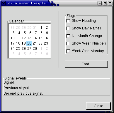
9.13 Color Selection
gtk_color_selection_set_color().
function gtk_color_selection_new () : PGtkWidget;
function gtk_color_selection_dialog_new (title : pgchar) : PGtkWidget;
GTK_COLOR_SELECTION_DIALOG(colorseldialog)^.ok_button).
procedure gtk_color_selection_set_has_opacity_control (colousel : PGtkColorSelection;
                                                       has_opacity : gboolean);
true
enables opacity. Likewise, has_opacity set to false will
disable opacity.
procedure gtk_color_selection_set_current_color (colorsel : PGtkColorSelection;
                                                 color : PGdkColor);

procedure gtk_color_selection_set_current_alpha (colorsel : PGtkColorSelection;
                                                 alpha : guint16);
procedure gtk_color_selection_get_current_color (colorsel : PGtkColorSelection;
                                                 color : PGdkColor);

procedure gtk_color_selection_get_current_alpha (colorsel : PGtkColorSelection;
                                                 alpha : guint16);
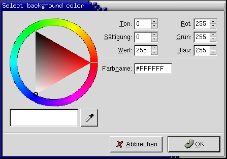
program Colorsel;

uses glib2, gdk2, gtk2;

var
   colorseldlg : PGtkWidget = nil;
   drawingarea : PGtkWidget = nil;
   color : TGdkColor;

{ Color changed handler }

procedure color_changed_cb (Widget : PGtkWidget;
                            colorsel : PGtkColorSelection); cdecl;
var
   ncolor : TGdkColor;
begin
   gtk_color_selection_get_current_color(colorsel,
                                         @ncolor);
   gtk_widget_modify_bg(drawingarea, GTK_STATE_NORMAL, @ncolor);
end;

{ Drawingarea event handler }

function area_event (widget : PGtkWidget; event : pGdkEvent;
                     client_data : gpointer) : boolean; cdecl;
var
   handled  : boolean = false;
   response : integer;
   colorsel : PGtkColorSelection;
begin
   { Check if we've received a button pressed event }
   if (event^._type = GDK_BUTTON_PRESS) then
   begin
      handled := true;

      { Create color selection dialog }
      if (colorseldlg = nil) then
         colorseldlg := gtk_color_selection_dialog_new('Select background color');

      { Get the ColorSelection widget }
      colorsel := GTK_COLOR_SELECTION(GTK_COLOR_SELECTION_DIALOG(colorseldlg)^.colorsel);

      gtk_color_selection_set_previous_color(colorsel, @color);
      gtk_color_selection_set_current_color(colorsel, @color);
      gtk_color_selection_set_has_palette(colorsel, true);

      { Connect to the "color_changed" signal, set the client-data
      to the colorsel widget }
      g_signal_connect(colorsel, 'color_changed',
                       G_CALLBACK(@color_changed_cb), gpointer(colorsel));

      { Show the dialog }
      response := gtk_dialog_run(GTK_DIALOG(colorseldlg));

      if (response = GTK_RESPONSE_OK) then
         gtk_color_selection_get_current_color(colorsel, @color)
      else
         gtk_widget_modify_bg(drawingarea, GTK_STATE_NORMAL, @color);

      gtk_widget_hide(colorseldlg);
   end;
   area_event := handled;
end;

{Close down and exit handler}

function destroy_window (widget : PGtkWidget; event : PGdkEvent;
                         data   : gpointer) : boolean; cdecl;
begin
   gtk_main_quit();
   destroy_window := true;
end;

var
   window : PGtkWidget;

begin
   { Initialize the toolkit, remove gtk-related commandline stuff }
   gtk_init(@argc, @argv);

   { Create toplevel window, set title and policies. }
   window := gtk_window_new(GTK_WINDOW_TOPLEVEL);
   gtk_window_set_title(GTK_WINDOW(window), 'Color selection test');
   gtk_window_set_resizable(GTK_WINDOW(window), true);

   { Attach to the "delete" and "destroy" events so we can exit }
   g_signal_connect(window, 'delete-event',
                    G_CALLBACK(@destroy_window), gpointer(window));

   { Create drawingarea, set size and catch button events }
   drawingarea := gtk_drawing_area_new();

   color.red := 0;
   color.blue := 65535;
   color.green := 0;
   gtk_widget_modify_bg(drawingarea, GTK_STATE_NORMAL, @color);

   gtk_widget_set_size_request(GTK_WIDGET(drawingarea), 200, 200);

   gtk_widget_set_events(drawingarea, GDK_BUTTON_PRESS_MASK);

   g_signal_connect(drawingarea, 'event',
                    G_CALLBACK(@area_event), gpointer(drawingarea));

   { Add drawingarea to window, then show them both }
   gtk_container_add(GTK_CONTAINER(window), drawingarea);

   gtk_widget_show(drawingarea);
   gtk_widget_show(window);

   { Enter the gtk_main loop (this never returns) }
   gtk_main();
end.
9.14 File Selections
function gtk_file_selection_new (title : pgchar) : PGtkWidget;
procedure gtk_file_selection_set_filename (filesel : PGtkFileSelection;
                                           filename : pgchar);
function gtk_file_selection_get_filename (filesel : PGtkFileSelection) : pgchar;
  dir_list
  file_list
  selection_entry
  selection_text
  main_vbox
  ok_button
  cancel_button
  help_button
testgtk.c, modified
to run on its own and translated into Pascal. As you will see, there is
nothing much to creating a file selection widget. While in this example
the Help button appears on the screen, it does nothing as there is not
a signal attached to it.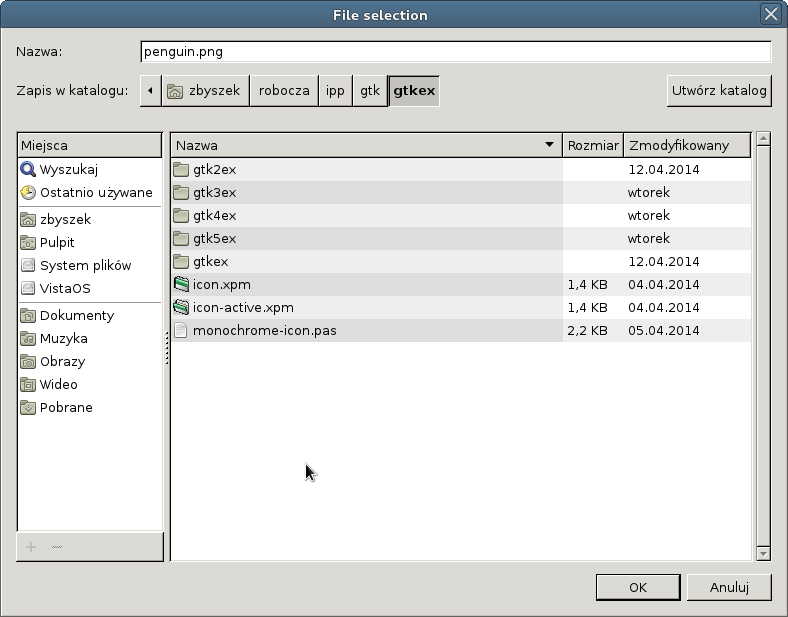
program Filesel;

uses glib2, gdk2, gtk2;

{ Get the selected filename and print it to the console }

procedure file_ok_sel (w : PGtkWidget; fs : PGtkFileChooserDialog); cdecl;
begin
    writeln(gtk_file_chooser_get_filename(GTK_FILE_CHOOSER(fs)));
end;

var
   filew : PGtkWidget;
   ok_button, cancel_button : PGtkWidget;

begin
   gtk_init(@argc, @argv);

   { Create a new file selection widget }
   filew := gtk_file_chooser_dialog_new('File selection', nil,
                                        GTK_FILE_CHOOSER_ACTION_SAVE,
                                        nil);
   ok_button := gtk_dialog_add_button(GTK_DIALOG(filew), GTK_STOCK_OK,
                                      GTK_RESPONSE_OK);
   cancel_button := gtk_dialog_add_button(GTK_DIALOG(filew), GTK_STOCK_CANCEL,
                                          GTK_RESPONSE_CANCEL);

   g_signal_connect(filew, 'destroy',
                    G_CALLBACK(@gtk_main_quit), nil);

   { Connect the ok_button to file_ok_sel function }
   g_signal_connect(ok_button, 'clicked',
                    G_CALLBACK(@file_ok_sel), filew);

   { Connect the cancel_button to destroy the widget }
   g_signal_connect_swapped(cancel_button, 'clicked',
                            G_CALLBACK(@gtk_widget_destroy), filew);

   { Lets set the filename, as if this were a save dialog, and we are
     giving a default filename }
   gtk_file_chooser_set_current_name(GTK_FILE_CHOOSER(filew),
                                     'penguin.png');

   gtk_widget_show(filew);
   gtk_main();
end.