COVID-19 in Spain
Spain was one of the first European countries to be heavily affected by the COVID-19 pandemic. The country faced multiple waves of infection, each with different characteristics in terms of transmission, severity, and public health response. This page offers a visual overview of the pandemic's trajectory in Spain, supported by data visualizations that highlight key moments and trends.
The first major indicator of the pandemic's evolution is the number of new confirmed cases over time. This metric shows the magnitude and timing of the different waves.
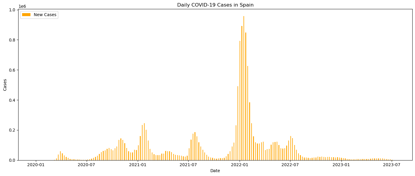
Figure 1: Daily confirmed COVID-19 cases in Spain.
The graph shows that after several intense waves, the number of daily cases began to decline steadily in 2022, indicating the beginning of a more controlled phase of the pandemic.
While case numbers reflect the spread of the virus, the number of deaths reveals its human cost, particularly during the early months of the crisis.
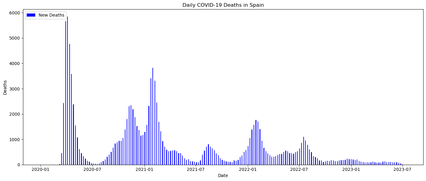
Figure 2: Daily COVID-19 related deaths reported in Spain.
In the early stages, the death toll was extremely high, especially in March and April 2020. This was largely due to limited knowledge of the virus, lack of treatments, and overwhelmed health systems. Later waves showed significantly fewer deaths thanks to better medical care and the impact of vaccination.
This interactive view allows us to compare the evolution of confirmed cases by year during each year of the pandemic.
Figure 3: Interactive visualization of COVID-19 cases by year.
The steep rise in 2020 is followed by an even greater surge in 2021, with a marked decline in 2022 thanks to vaccination and acquired immunity.
One of the groups most affected by the pandemic was the elderly. Monitoring how the virus impacted people aged 60 and over helps us understand the vulnerabilities of this population.
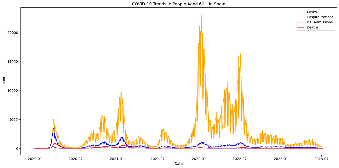
Figure 4: COVID-19 trends in individuals aged 60 and older.
This graph highlights how the elderly were disproportionately affected during the early waves. However, with targeted vaccination and protective measures, the situation improved in later phases.
Another important way to understand the pandemic’s evolution is by tracking how quickly cases grew. The chart below shows the weekly percentage growth of COVID-19 cases over time.
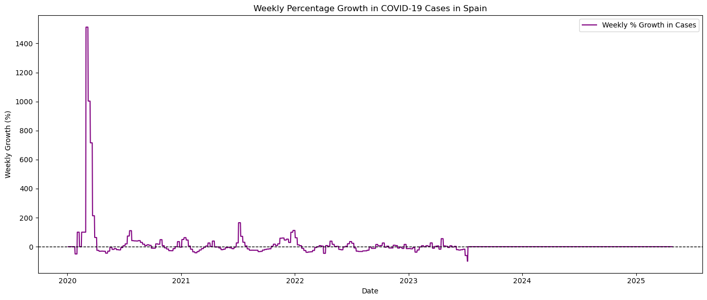
Figure 5: Weekly percentage growth in confirmed COVID-19 cases in Spain.
The initial weeks saw explosive growth, with some weeks exceeding 1000% increase. Over time, the weekly growth rate stabilized near zero, indicating control of the outbreak.
Another important metric is the Case Fatality Rate (CFR), which indicates how deadly the disease is relative to the number of confirmed infections.
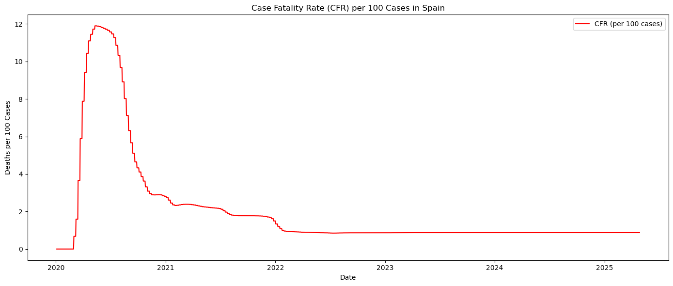
Figure 6: Case Fatality Rate (CFR) per 100 confirmed cases in Spain.
The CFR was extremely high during the first months, but it decreased quickly as testing expanded and milder cases were detected. This also reflects the improvement in medical protocols and patient care.
The pressure on hospitals was one of the key challenges during the pandemic. Understanding the evolution of hospital and ICU occupancy helps measure the burden on the healthcare system.
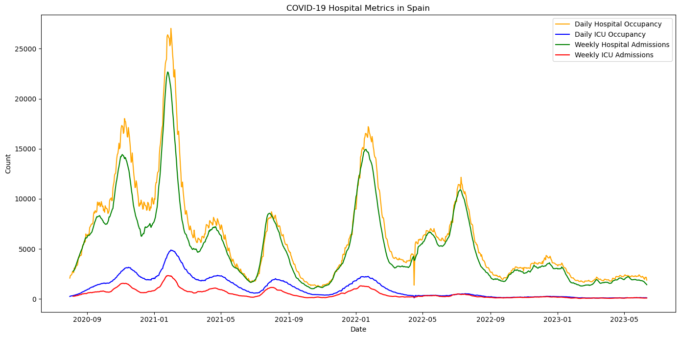
Figure 7: Hospital and ICU occupancy, and weekly admissions in Spain.
After the critical waves of 2020 and early 2021, hospital metrics began to stabilize, reflecting the transition from crisis mode to a more manageable phase of healthcare response.
In addition to national trends, it's useful to compare how each region evolved individually. The following visualization presents cumulative cases per community.
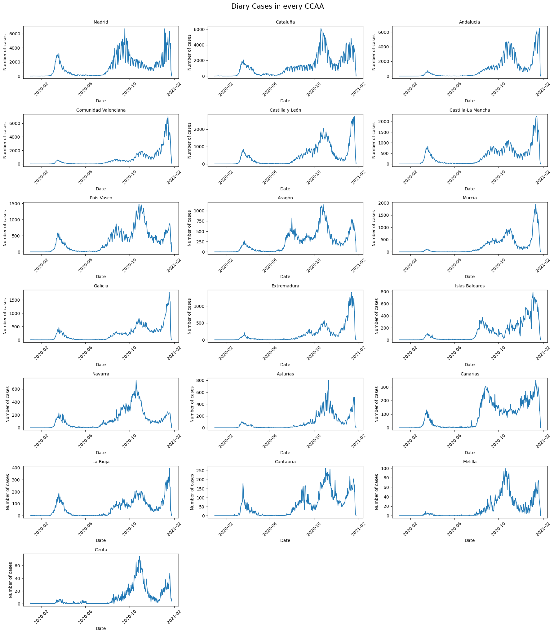
Figure 8: Cumulative COVID-19 cases per autonomous community.
The differences in total case numbers reflect demographic, geographic, and healthcare capacity factors. Regions with stronger containment strategies also show slightly better outcomes.
Figure 9: Interactive chart showing daily cases by autonomous community.
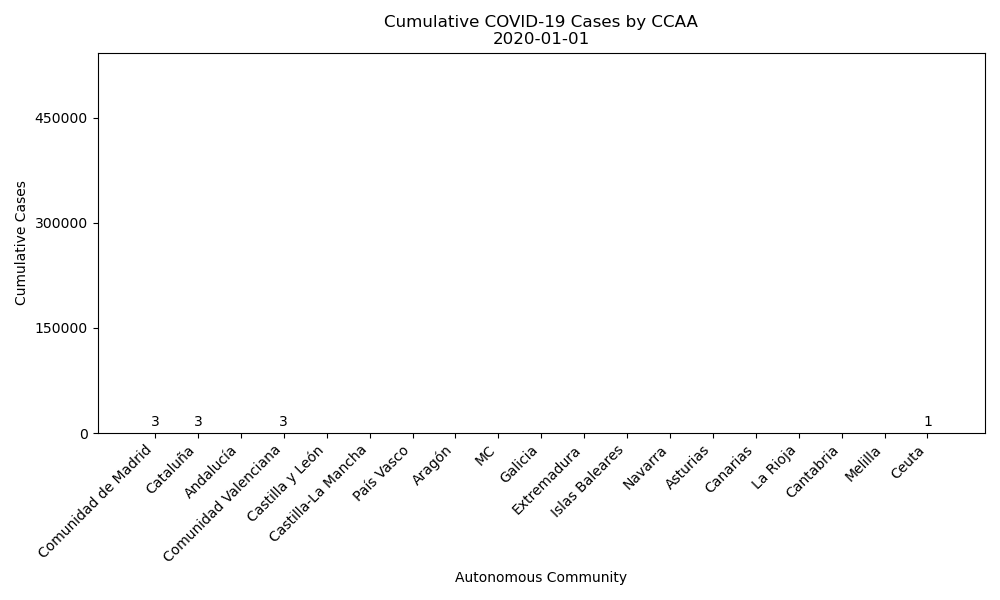
Figure 10: Animated bar chart of cumulative COVID-19 cases in each autonomous community (CCAA) in Spain over time.
This visualizations clearly shows that Madrid, Catalonia, Valencia and Andalusia were among the most affected regions, with peaks occurring at slightly different times.
Looking at a more granular level, the distribution of cases by province reveals interesting insights about geographic patterns and urban versus rural spread.
Figure 11: Interactive map of COVID-19 cases by province in Spain.
The highest concentration of cases corresponds to densely populated areas, highlighting the role of mobility and population density in transmission.
Some provinces consistently reported more cases than others. The following chart presents the top 5 provinces with the most cumulative cases.
Figure 12: Top 5 provinces with the highest number of reported COVID-19 cases.
Madrid, Barcelona, and Valencia lead in total cases, largely due to their population size and central role in economic and social activities.
Vaccination has been a turning point in the pandemic. Monitoring vaccine uptake provides context for the reduction in severe outcomes.
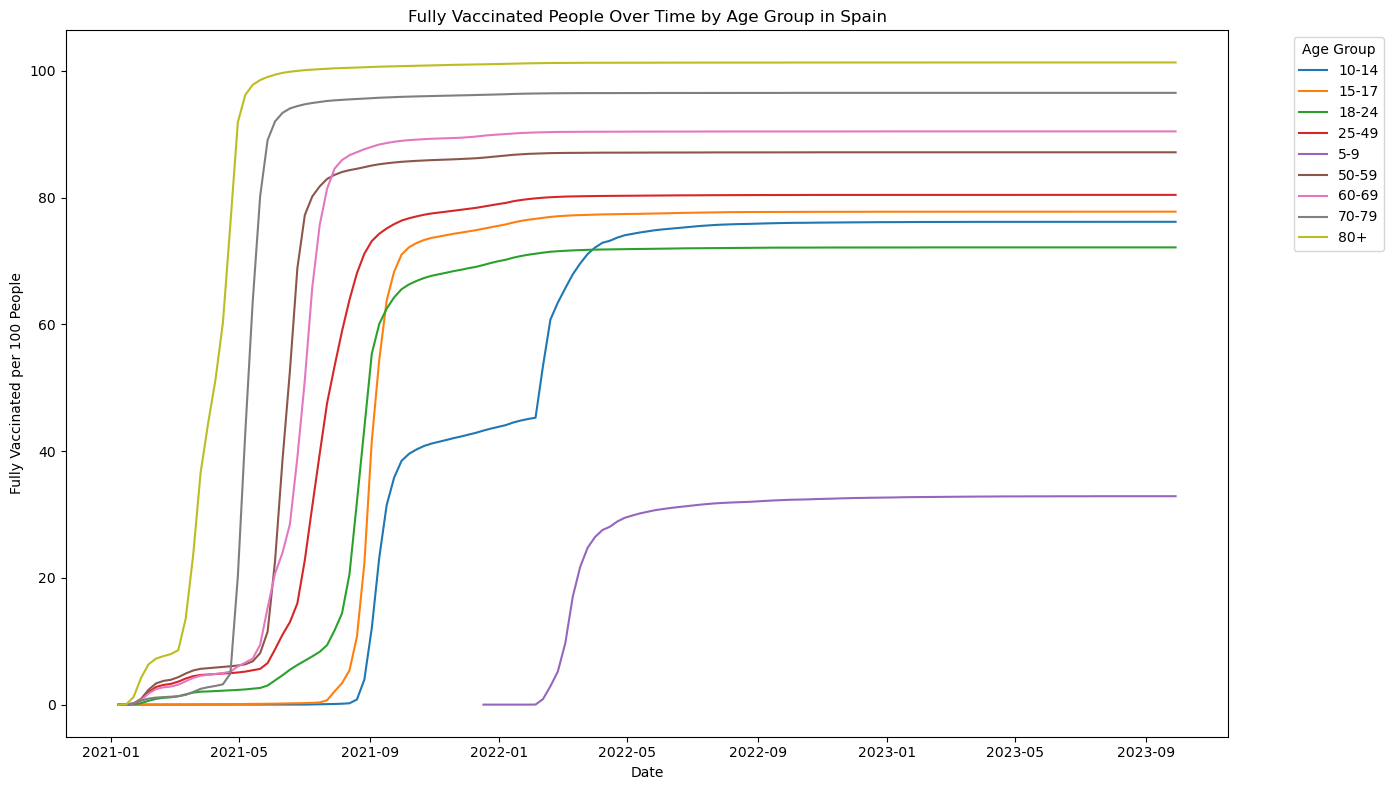
Figure 13: COVID-19 vaccination progress in Spain over time.
Vaccination campaigns began slowly but accelerated significantly in 2021, with high coverage achieved by the end of the year. This helped reduce hospitalizations and deaths in later waves.
Vaccination coverage varied by age group. Older populations were prioritized, which had a visible effect on mortality reduction.
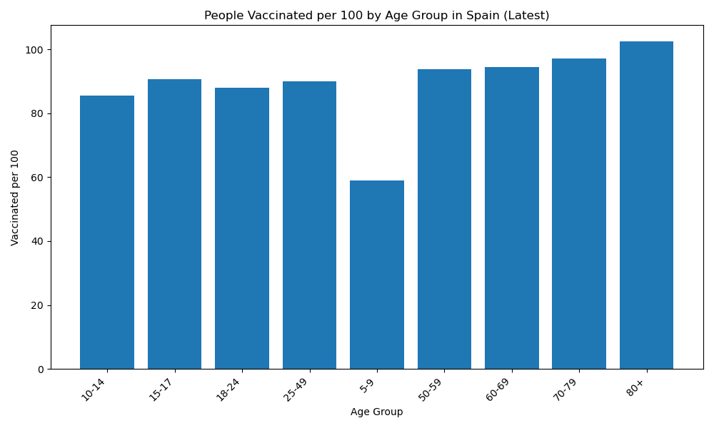
Figure 14: Latest vaccination coverage per 100 people, by age group.
Figure 15: Interactive plot of vaccination coverage in Spain by age group over time.
Vaccination rates reached nearly 100% in the 80+ age group, while coverage among younger children remained significantly lower, reflecting policy and risk-based prioritization.
Understanding how different COVID-19 indicators are related helps identify patterns and anticipate healthcare demands. The following correlation matrix quantifies the strength of these relationships.
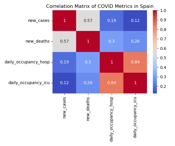
Figure 16: Correlation matrix between cases, deaths, and hospital metrics in Spain.
The chart shows a strong correlation between ICU and hospital occupancy, and a moderate correlation between new cases and deaths. These insights are useful for resource planning.
Public policy responses played a major role in managing the pandemic. The Stringency Index summarizes the severity of government-imposed restrictions such as lockdowns, school closures, and travel bans.
Figure 17: Interactive plot of Spain's COVID-19 policy stringency index over time.
The data shows sharp increases in restrictions during major waves, followed by gradual relaxation. The most stringent period occurred during the initial 2020 lockdown, with subsequent fluctuations based on case surges.
Finally, we take a closer look at the specific public health measures adopted in Spain over time, broken down by type of restriction (schools, workplaces, gatherings, etc.).
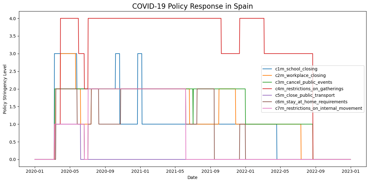
Figure 18: Timeline of major policy interventions in Spain.
This visualization helps explain the effects of policy decisions on infection dynamics. Stringent restrictions—especially during the first wave—were gradually relaxed, with targeted reintroductions during critical moments in 2021 and early 2022.
Forecasting COVID-19 Cases and Deaths in Spain
In this section, we present a forecast of COVID-19 cases and deaths in Spain using monthly aggregated data. This approach was chosen because aggregating by months we can significantly improve the performance of forecasting models. It also helps avoid the common issue of models predicting zero values when trained on recent flat data.
By using data from 2020 to 2022 and applying an AR(10) model, the goal is to capture medium-term trends during the core period of the pandemic, rather than focusing only on the decline seen in 2023–2024. This gives more realistic and informative projections.
The following chart shows the forecast of monthly COVID-19 cases in Spain.
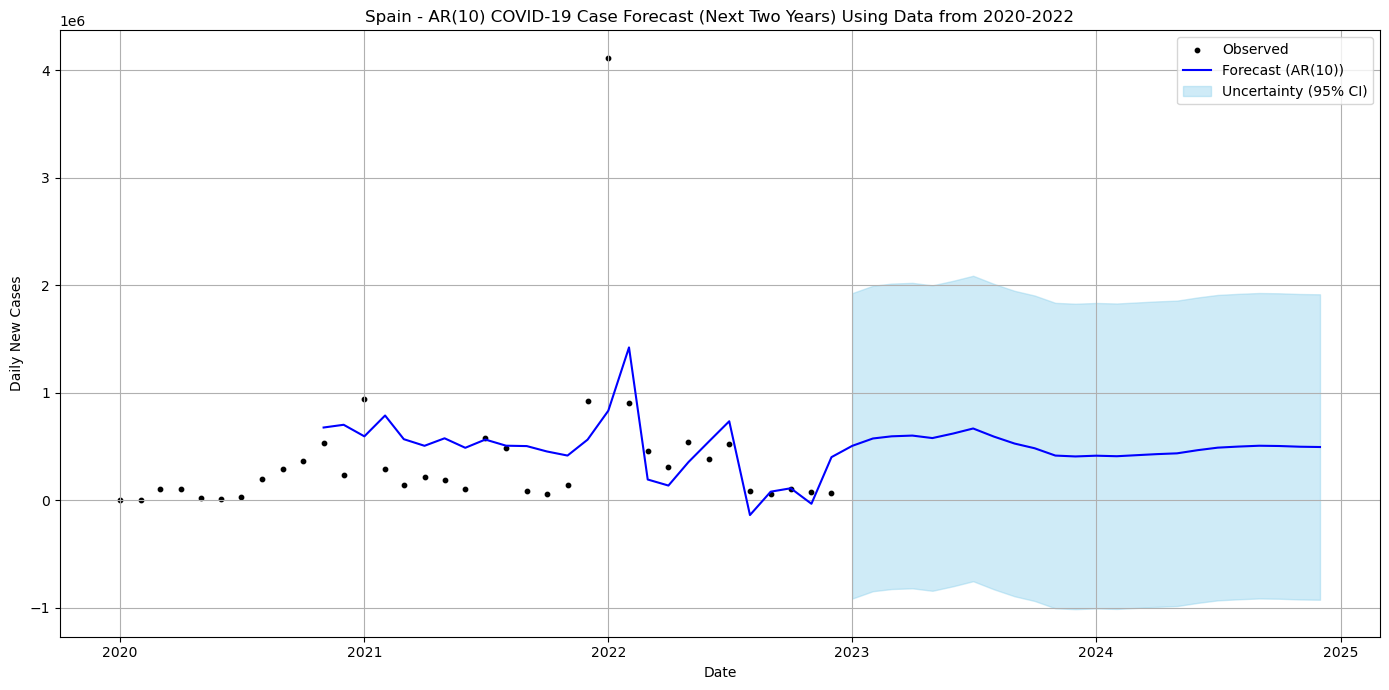
Figure 19: Forecast of COVID-19 monthly cases using AR(10) model (2020–2022 data).
Aggregating the data monthly helped smooth out noise and allowed the model to capture general trends and seasonality more effectively.
We also generated a similar forecast for monthly COVID-19 deaths in Spain, using the same method and time window.
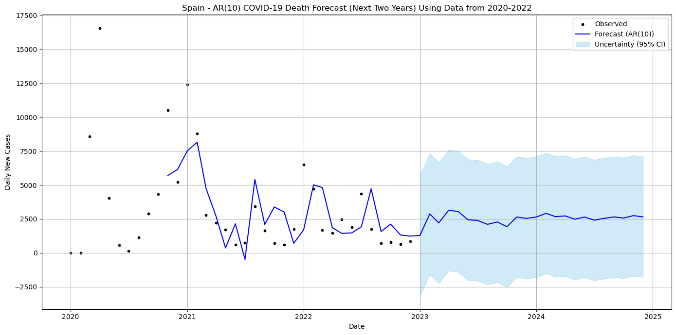
Figure 20: Forecast of COVID-19 monthly deaths using AR(10) model (2020–2022 data).
This prediction provides a realistic view of expected mortality trends, again supported by the stability gained from monthly data aggregation.
Spain and Poland: A Comparative Perspective
To better understand the COVID-19 situation in Spain, it is helpful to compare it with another European country. Poland serves as an interesting counterpart due to differences in demographics, healthcare infrastructure, and public policies.
We start by situating both countries in the global context of COVID-19. The following interactive chart shows the top 10 countries by number of confirmed cases.
Figure 21: Interactive chart of countries with the most reported COVID-19 cases globally.
Spain appears consistently among the countries with the highest number of confirmed cases, while Poland, though smaller, also experienced multiple strong waves.
To place Spain and Poland in the broader European context, the following chart compares total COVID-19 cases across some of the most affected countries in Europe.
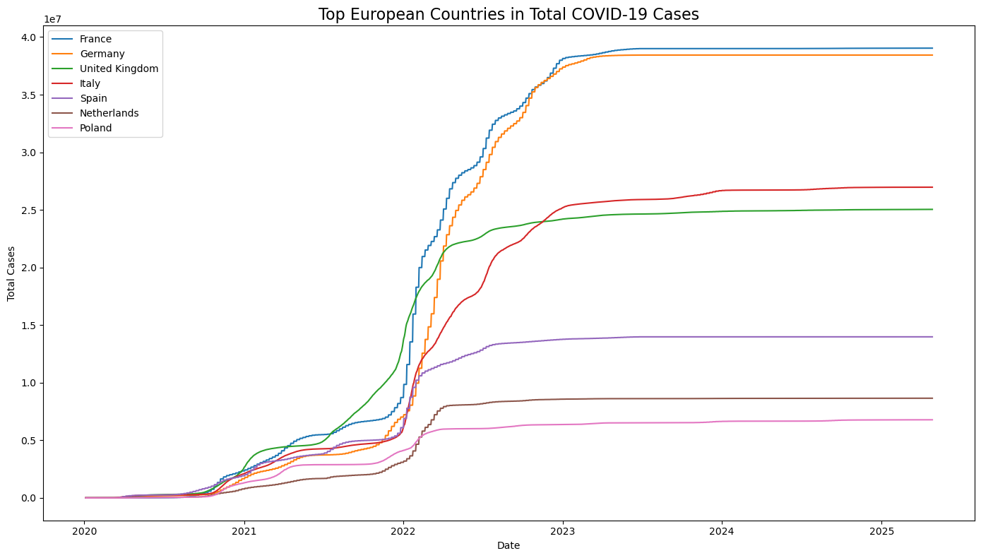
Figure 22: Cumulative number of confirmed COVID-19 cases in selected European countries.
Spain had a consistently high total case count, though still below countries like France, Germany, and the United Kingdom. Poland, while having a smaller population, remained in the lower range of total cases throughout the pandemic.
When comparing daily new cases between Spain and Poland (7-day moving average), we observe differences in timing and magnitude of the waves.
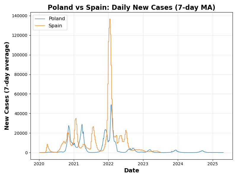
Figure 23: Daily new confirmed cases (7-day average) in Poland and Spain.
Spain had more intense early waves, while Poland experienced stronger peaks in the later phase of the pandemic.
The next chart compares the number of deaths over time in both countries, again using a 7-day average to smooth out fluctuations.

Figure 24: Daily reported deaths (7-day average) in Poland and Spain.
Despite Spain's higher total number of cases, Poland suffered very severe mortality spikes during certain periods, likely reflecting differences in healthcare strain and vaccine uptake.
Vaccination played a crucial role in shaping the trajectory of the pandemic. The following interactive plot compares the overall vaccination rates in both countries.
Figure 25: Interactive comparison of overall vaccination rates between Spain and Poland.
Spain achieved consistently higher coverage, which may explain the lower relative mortality in later waves.
Looking specifically at booster coverage reveals further differences in public health uptake.
Figure 26: Booster dose coverage in Poland and Spain over time.
While both countries launched booster campaigns, Spain reached more widespread coverage across age groups.
Vaccination by age group shows how the strategies differed across generations.
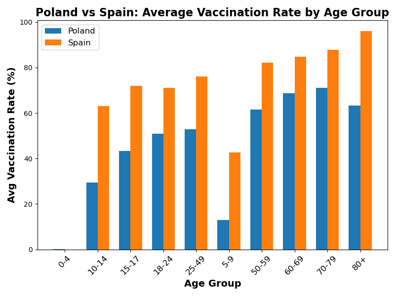
Figure 27: Comparison of vaccination rates by age group in Spain and Poland.
Spain maintained higher coverage especially among the elderly, while Poland showed lower uptake in younger and working-age groups.
Finally, we compare the stringency of government measures in both countries over time using the Oxford Stringency Index.
Figure 28: Annual average of policy stringency index in Poland and Spain.
Poland tended to maintain stricter policies for longer periods, while Spain's stringency peaked earlier and was reduced more gradually.